CICAEDIA UOMO Spring / Summer 2026: Schrödinger’s Dog.
Menswear gave me the space to finally be honest about the stuff I usually dodge. The sadness, the fear, the rage. My last spring season felt too sterile, too controlled, and I knew this could not be another neat experiment. It’s the debut. It has to be raw. The first sketches weren’t even drawings. They were me waking up, already stoned and exhausted, pulling on the same hoodie and shorts I had worn all week, taking a shitty mirror photo just to prove to my mom I was still alive and actually going to classes. That became the blueprint. The clothes I already re-wore every day, turned into something more.
The breaking point came in thesis year. The development for my graduating womenswear collection for my late father was already considerably heavy. Too heavy for that room. I will never forget when a professor told me not to include images of him in my portfolio because it “made people sad” and “ruined the illusion of the woman I was trying to create.” That moment was a catalyst, and things changed immediately after that. I didn’t care about the woman. I cared about my dad. He was the reason I started this label, the reason I was even in that room. To be told to erase him just to keep things pretty, was brutal and unwarranted. That was the start of my collapse. Not the kind you can even romanticize. Just a car crash of emotion followed by an immediate shift into a deep depression I hadn’t encountered before. Amidst this depression, and my slowly decreasing attendance, came a stare at an outfit I had worn 4 times that week, followed by a question. “where is this in your… designs?”
And here is where the paradox reveals itself. It is Schrödinger’s Dog; alive and dead, both conditions true at once. The box remains closed, the experiment unresolved. The same clothes I reached for in collapse, born of exhaustion and a need for safety, were suddenly called brilliant. Admired not in spite of the breakdown, but because of it. Comfort reinterpreted as craft. Despair reframed as design. You begin to understand that the language of survival is easily misread as the language of style, and that is the trap: suspended between ruin and recognition, control and collapse, you inhabit both states at once.
The men’s debut, staged just before my women’s collection for the Spring 2026 season, opened with a comedic bit, a small audio note that set the tone for how I approach menswear as a concept. The point was to mock it a little, to undercut the self-seriousness that so often surrounds it. Lucille Bluth’s voice boomed through the speakers: “It’s one banana, Michael. How much could it cost? Ten dollars?” Then a perfectly timed elevator ding. “You’ve never set foot inside a supermarket, have you?” “I don’t have time for this.” The absurdity of that moment is the point. It’s a joke about detachment from reality and about the kind of oblivious confidence that so often defines traditional menswear and the men it’s marketed to. It’s a voice of privilege, clueless but certain, setting up the satire before a single look even appears. Then, Smash Mouth’s “Sorry About Your Penis” crashes in, breaking whatever pretense of seriousness might have been left. It was an ironic jab at the American archetype of the straight man, a figure I have no interest in centering here. This line is not made for that idea. It is built for a unisex-centered audience drawn to masculine codes in both their classic forms and their most exaggerated extremes, from tailoring to more hypersexual silhouettes meant more for spectacle than for the street.
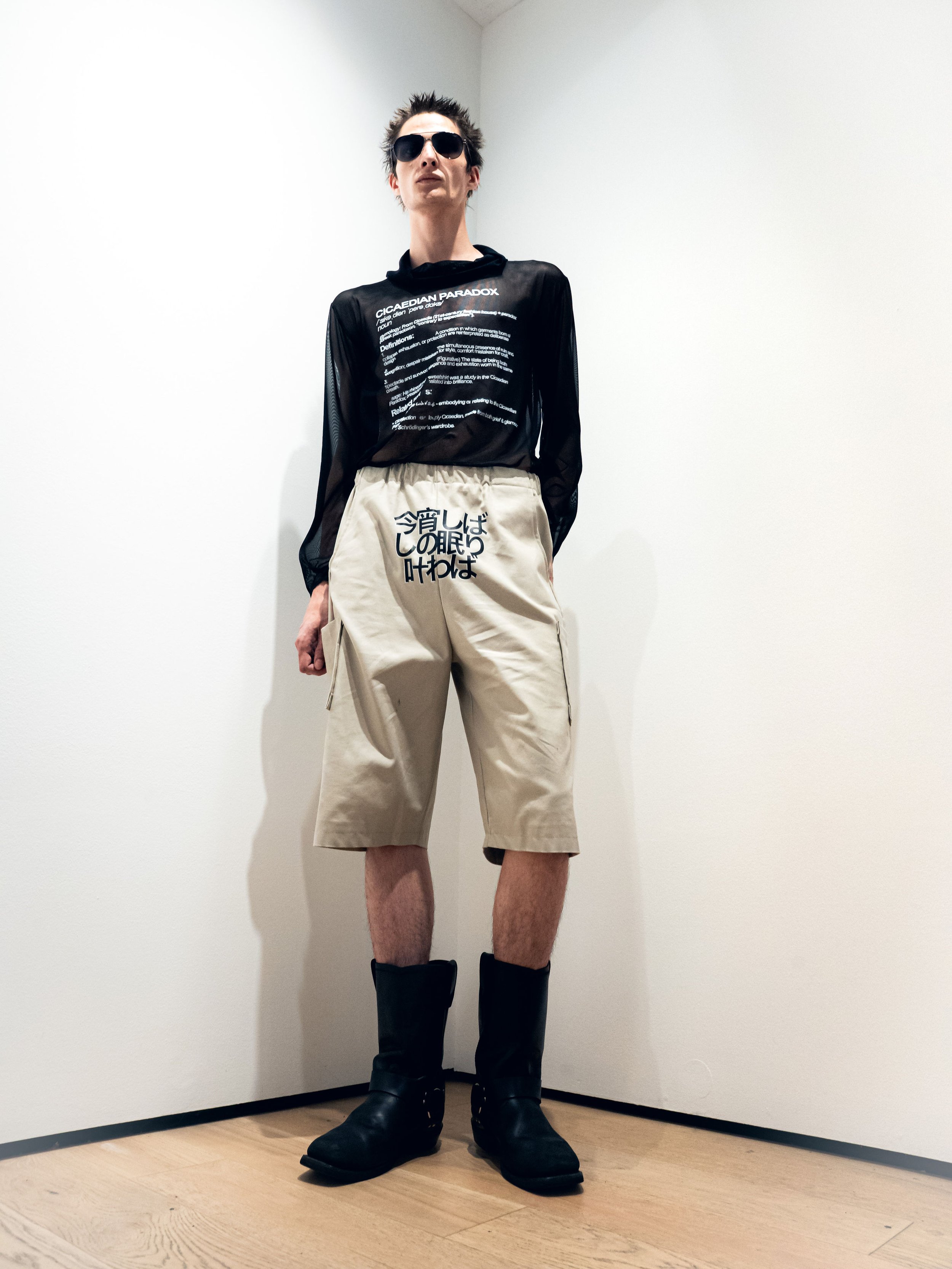
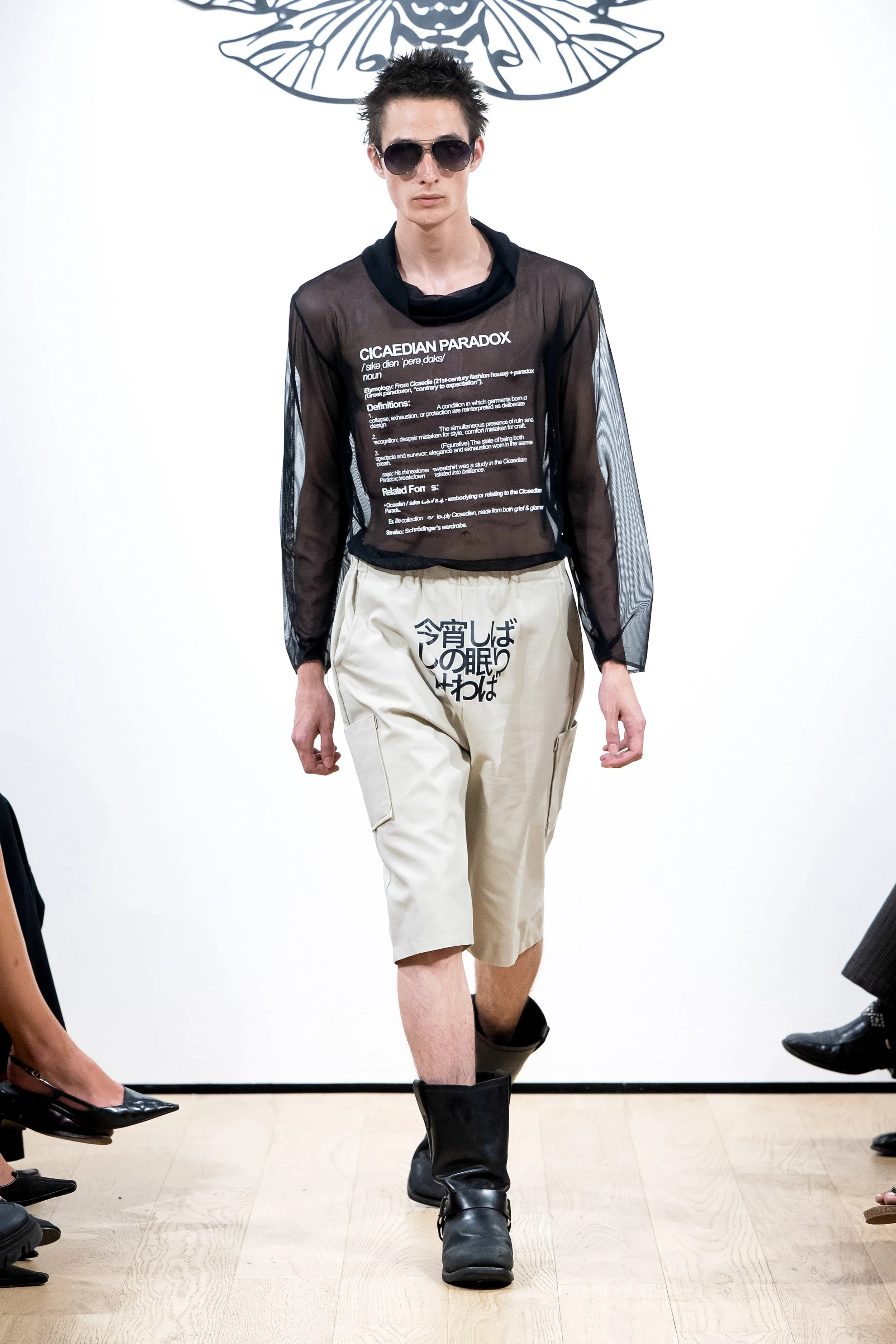
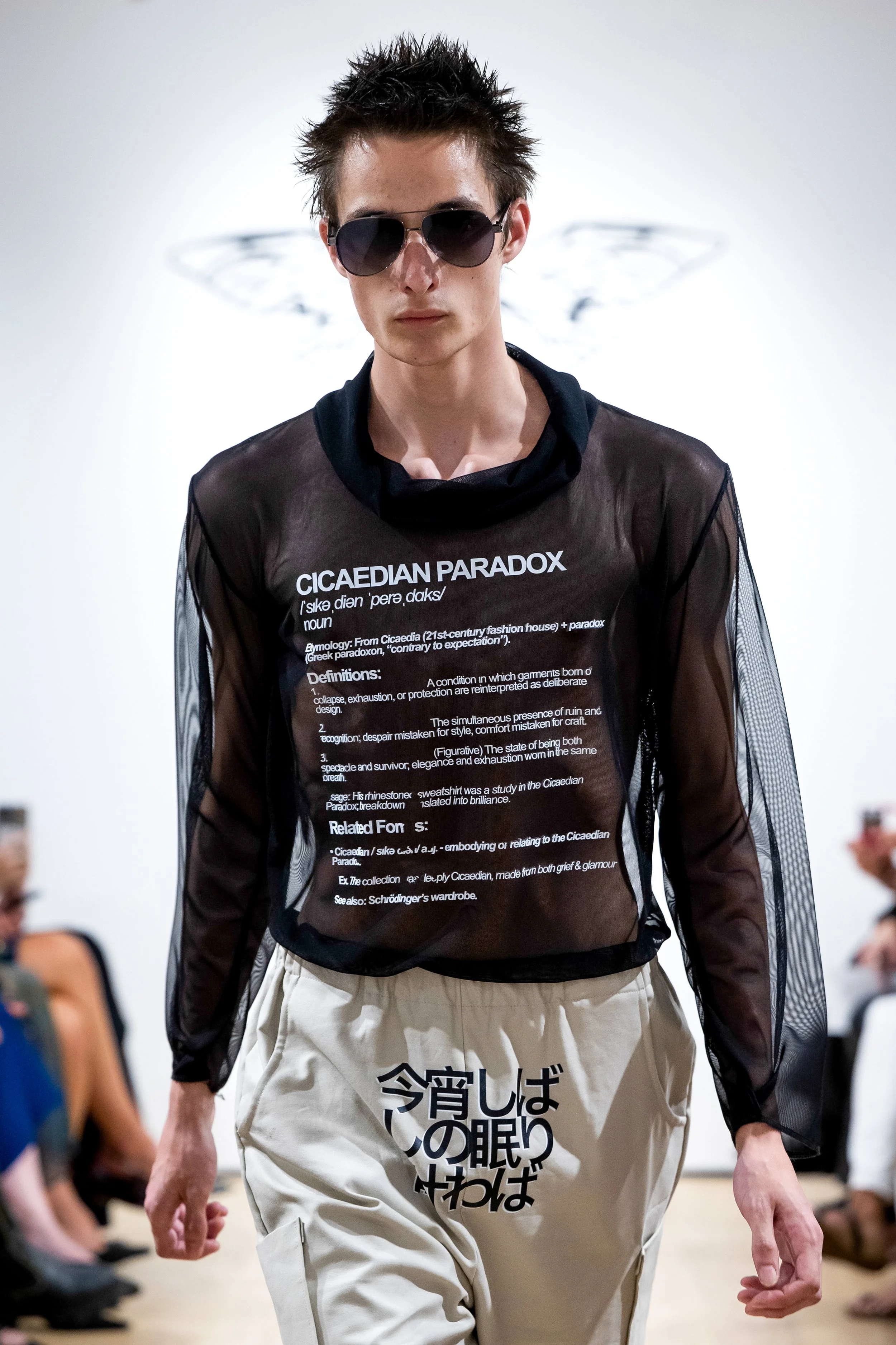
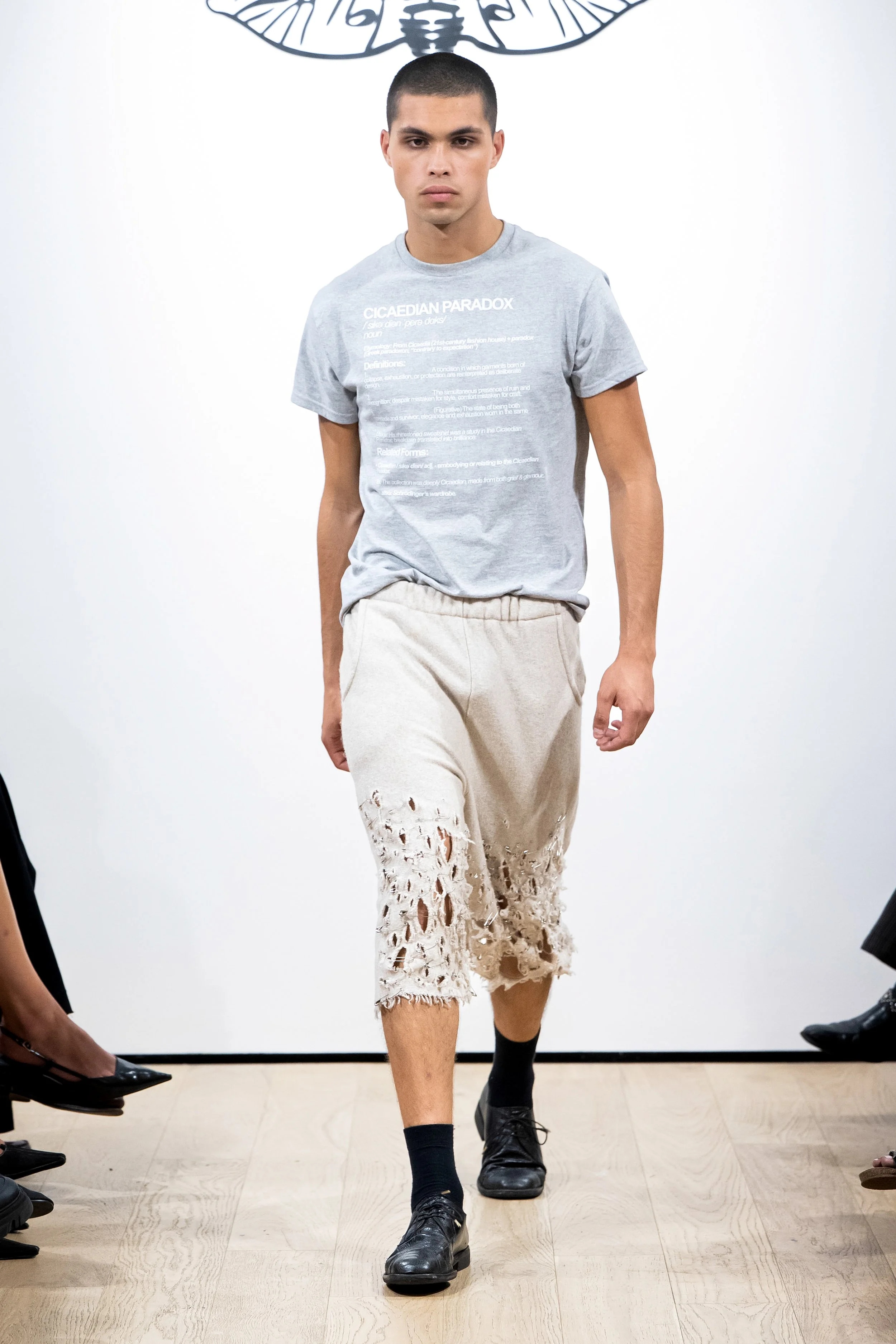
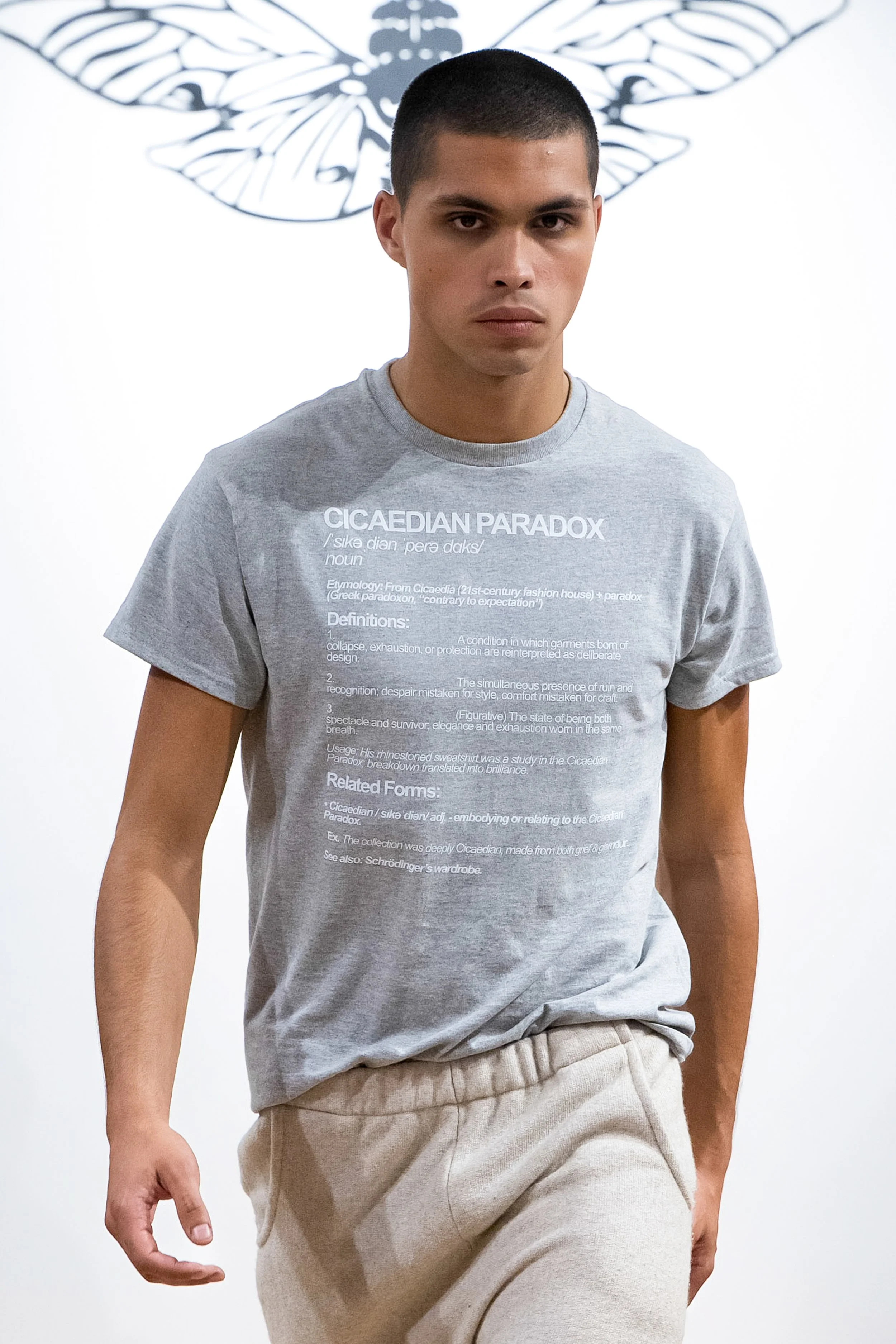
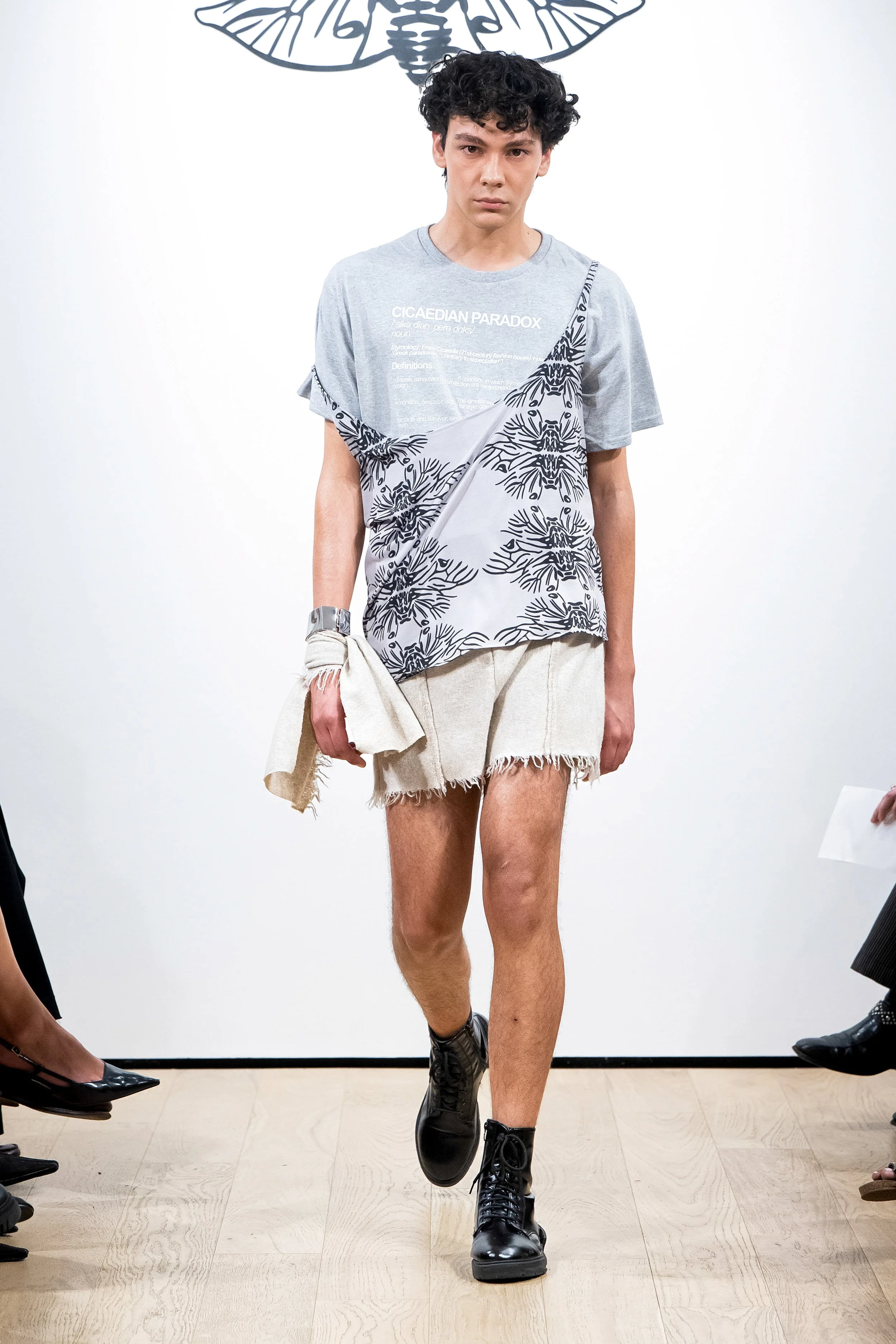
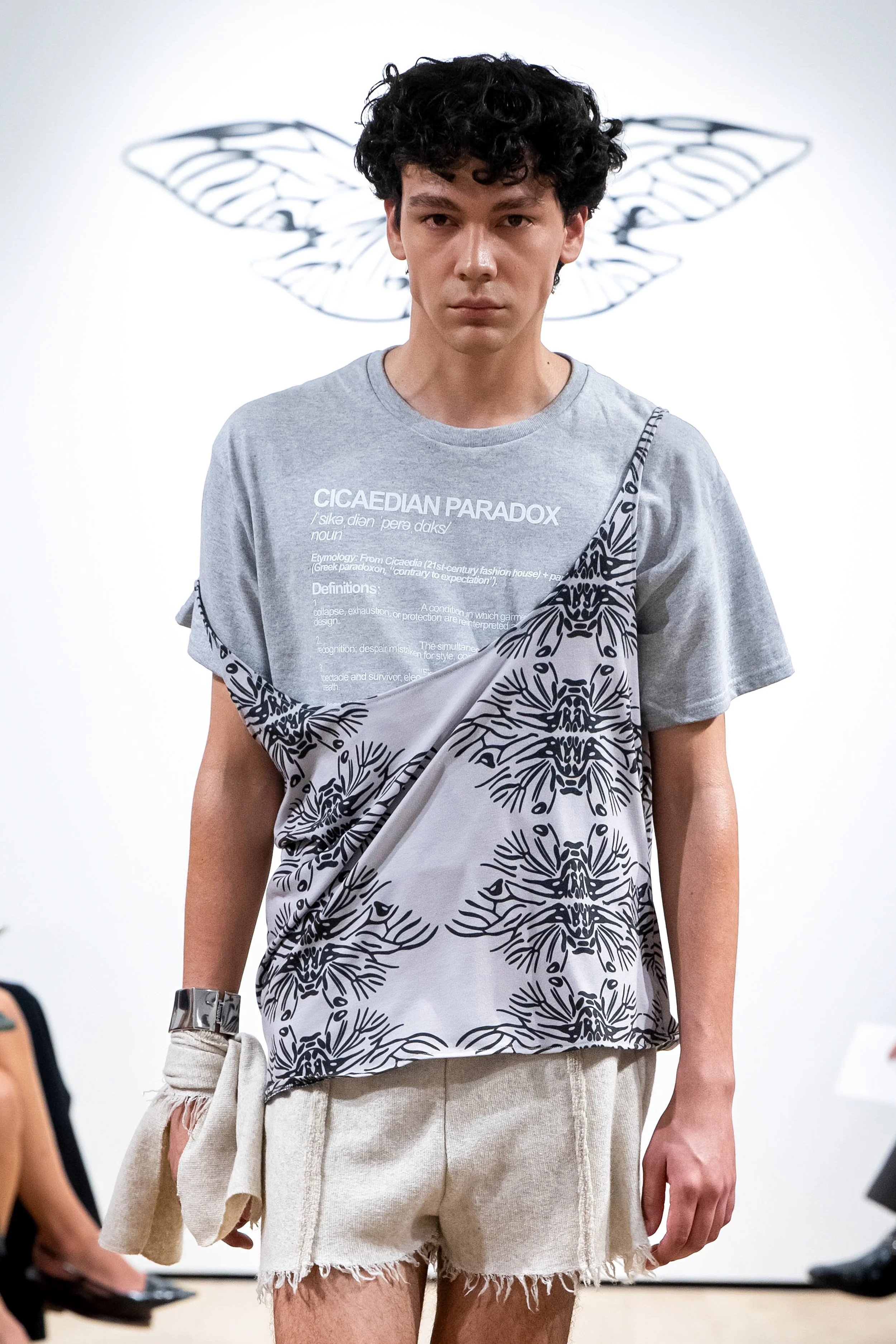
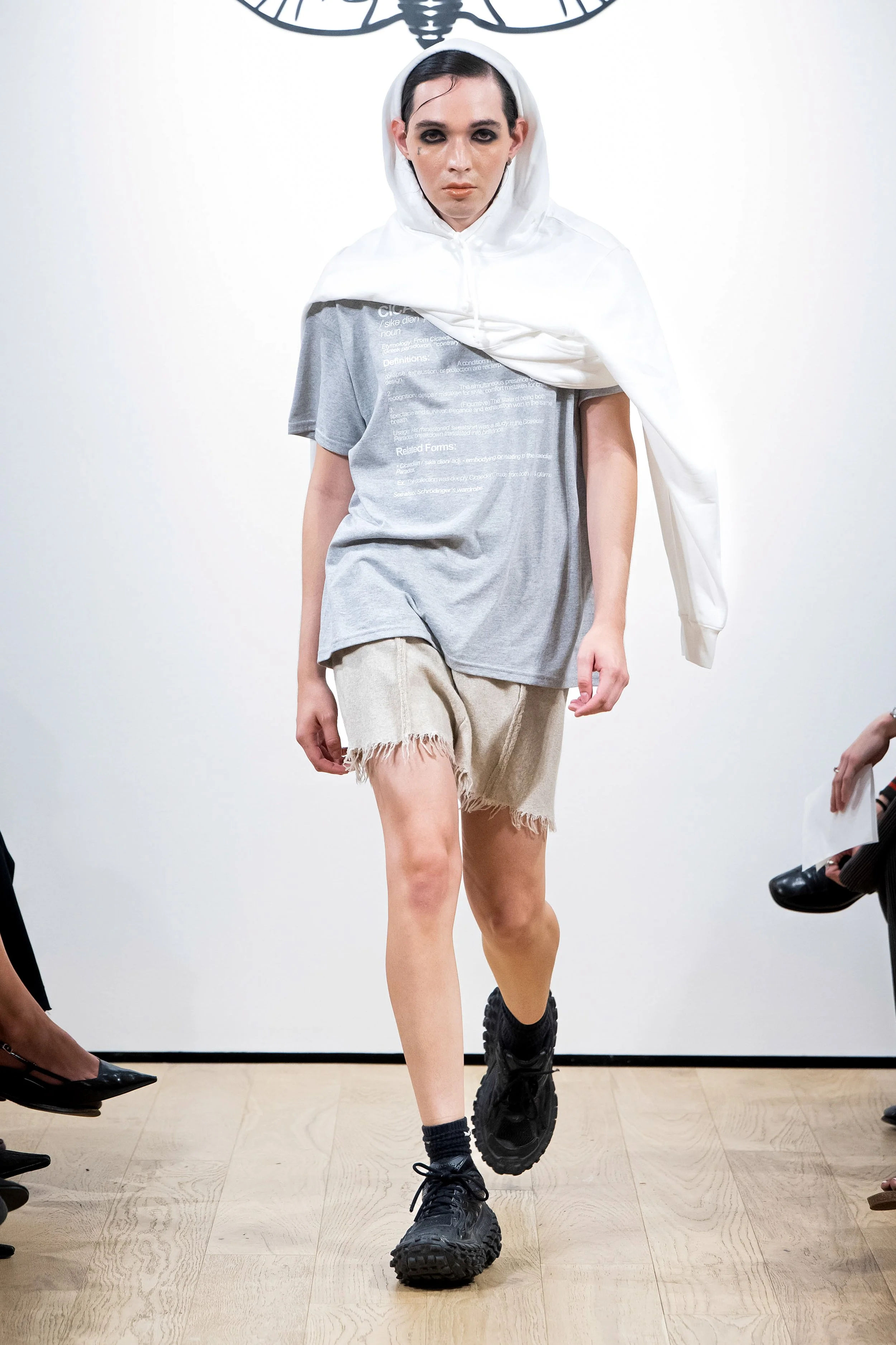
The show opens with a sheer shirt that has a full dictionary description. The “Cicaedian Paradox.” It came from a place I couldn’t describe in any other way. It wasn’t about coining a theory or trying to sound intellectual. It was about naming a state of being that sat at the heart of this collection; the strange tension between exhaustion and intention, collapse and control, instinct and design. I liked the idea that by writing it as though it were already a word, I could give something that felt abstract a kind of legitimacy, as if language itself could shoulder the weight of what I meant. It comes back around to feature on a variety of differently sized grey T-shirts.
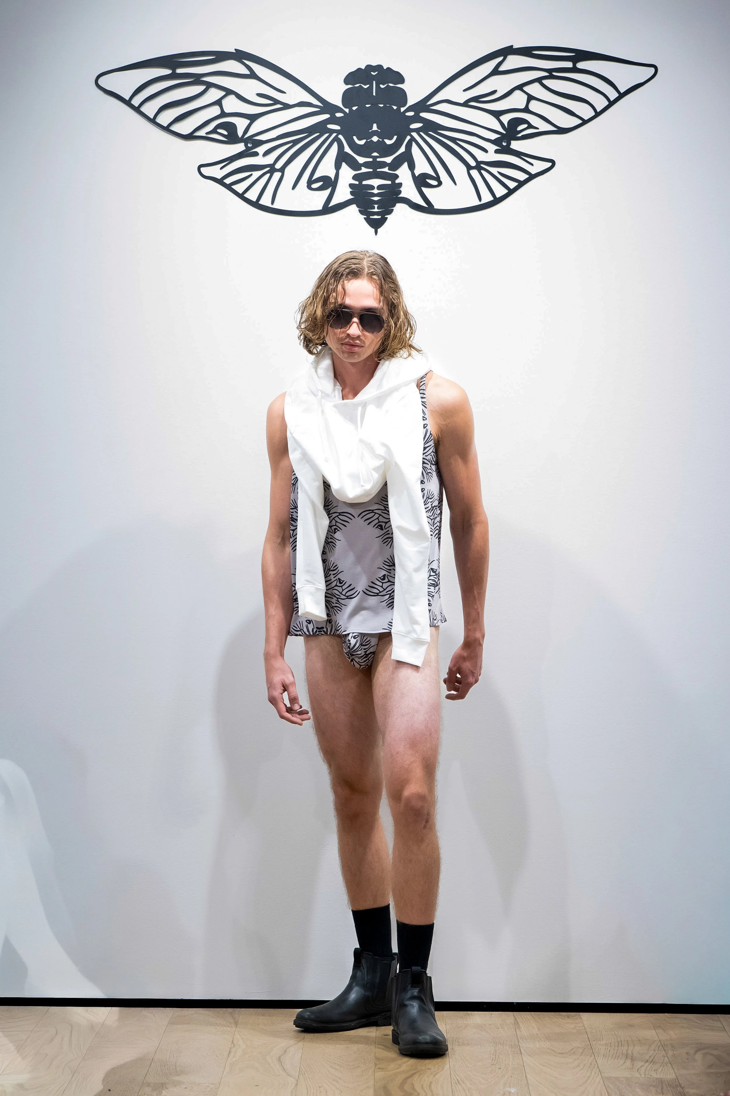
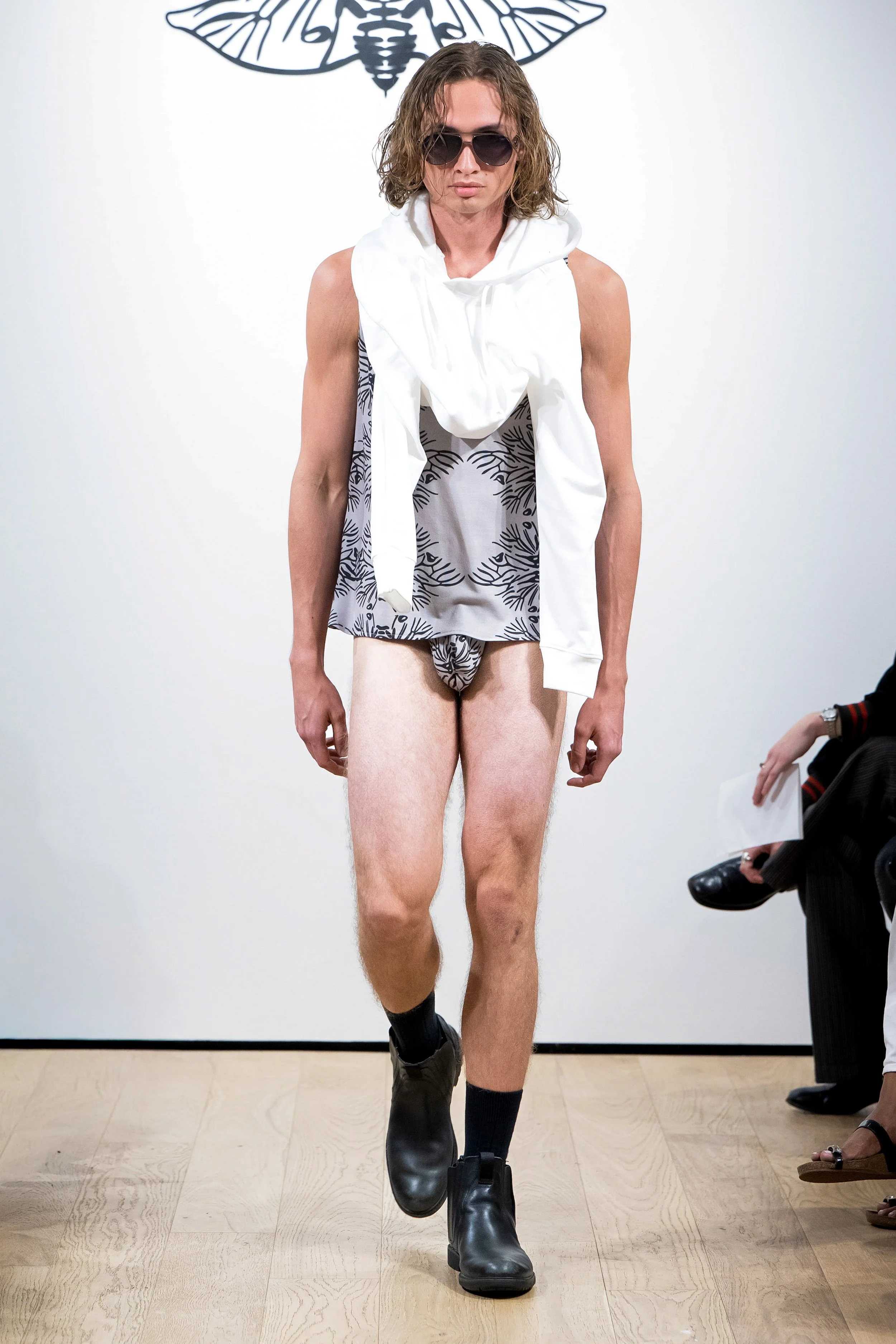
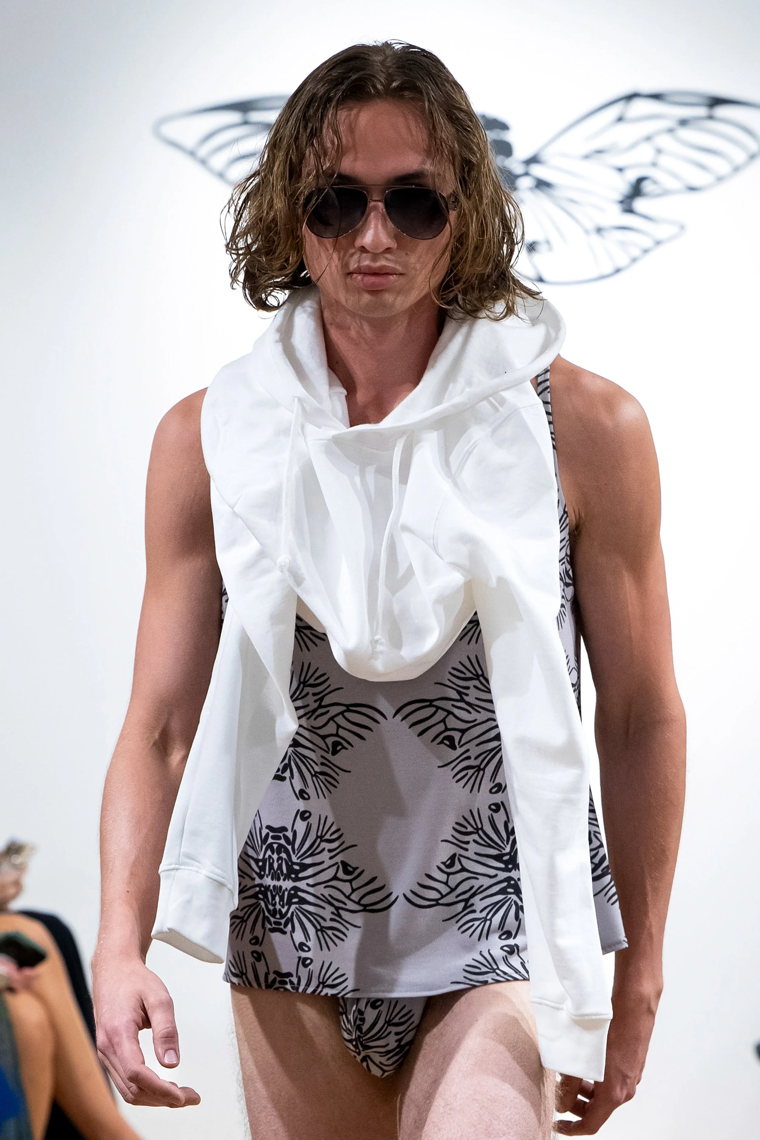
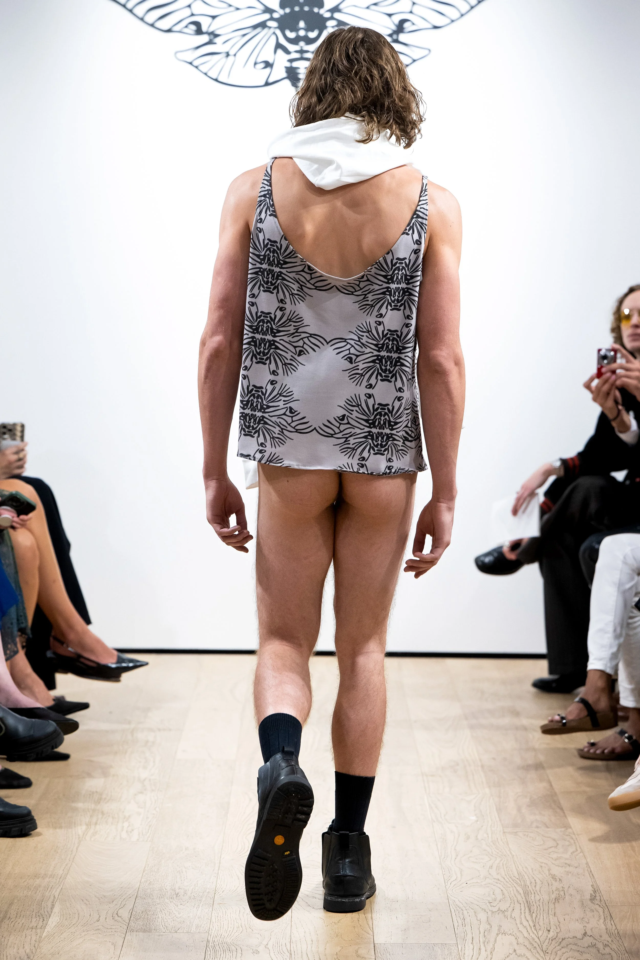
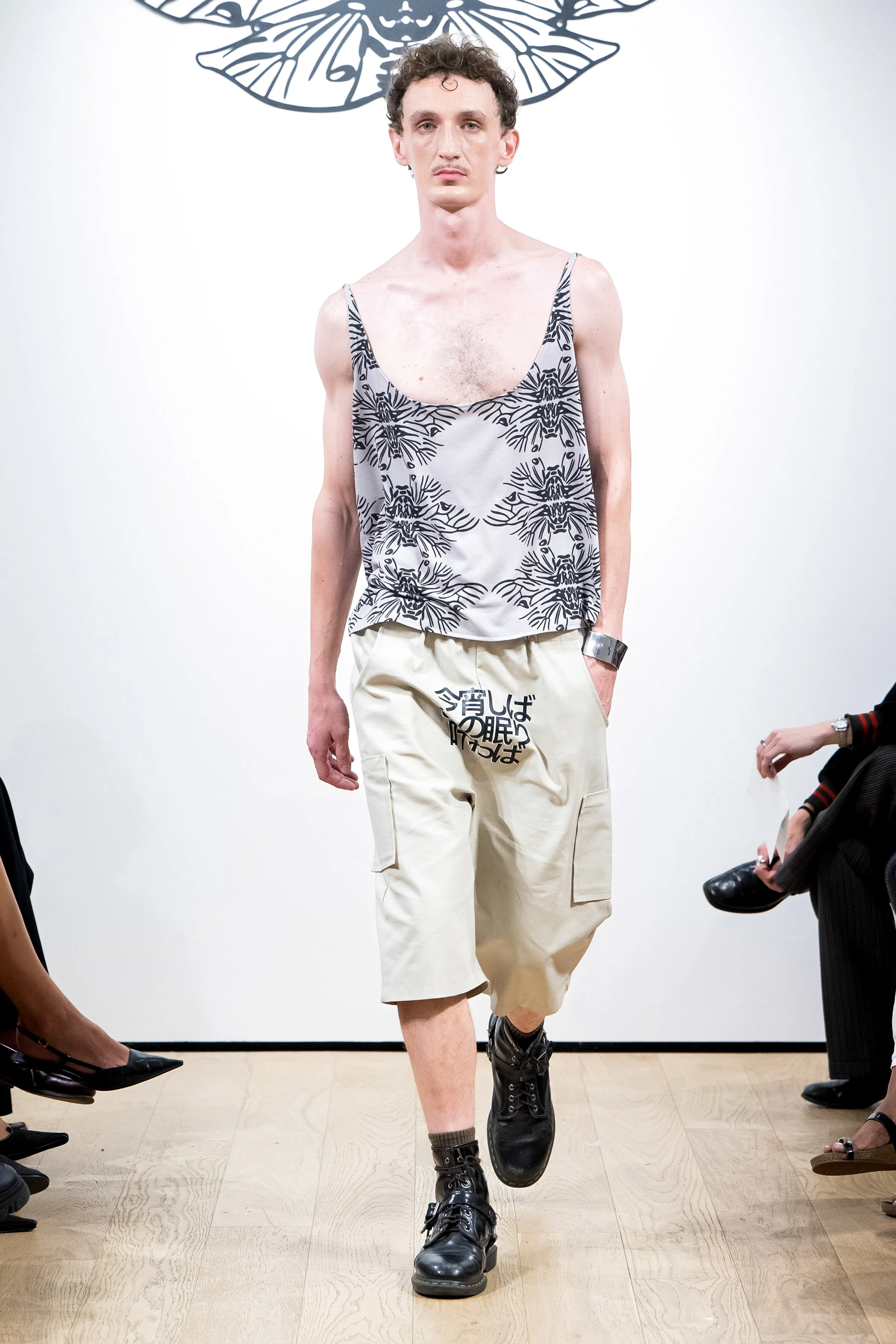
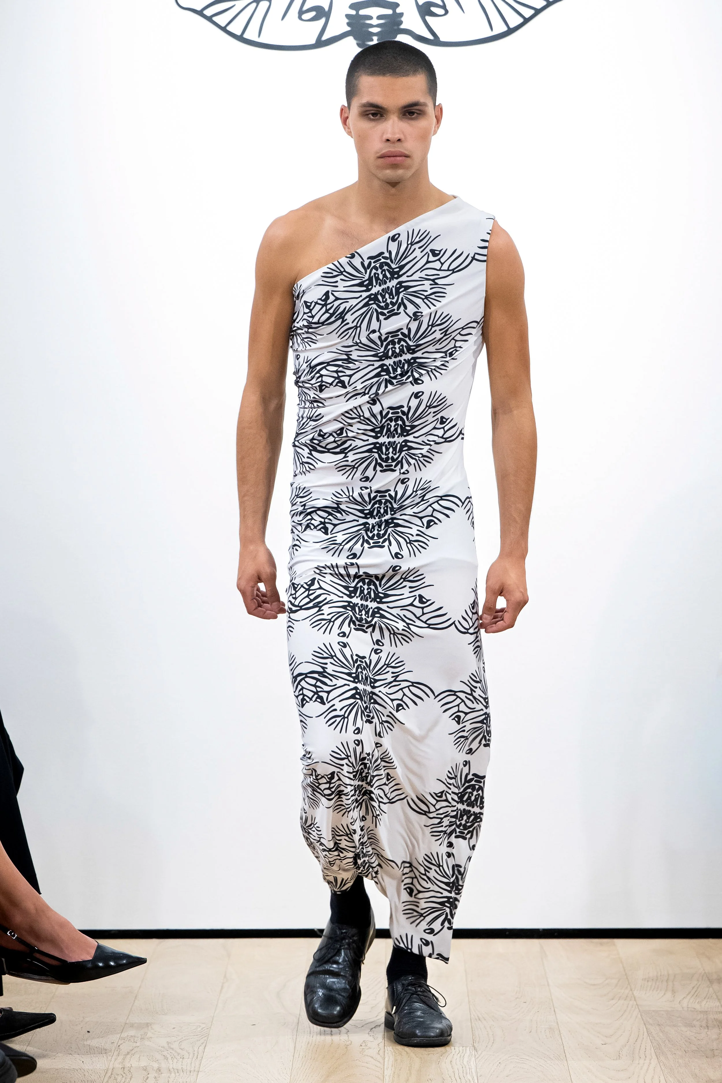
The defining pattern of the season is a modernized baroque motif constructed from the cicada logo. The emblem has been digitally altered and reconfigured into a continuous repeating form, with its wings and body mirrored and layered until they become an intricate ornamental structure. From a distance, the result appears as a refined decorative pattern reminiscent of classical textile design. Up close, its origin becomes clear, revealing the insect that has always been central to the identity of the house.This print reflects the collection’s core ideas of transformation, memory, and reinterpretation. It takes a foundational symbol of CICAEDIA and evolves it into something that operates both as surface decoration and as conceptual framework. The result is a textile that is at once historical and contemporary, visually complex yet immediately recognizable, embedding the brand’s emblem directly into the material language of the collection.
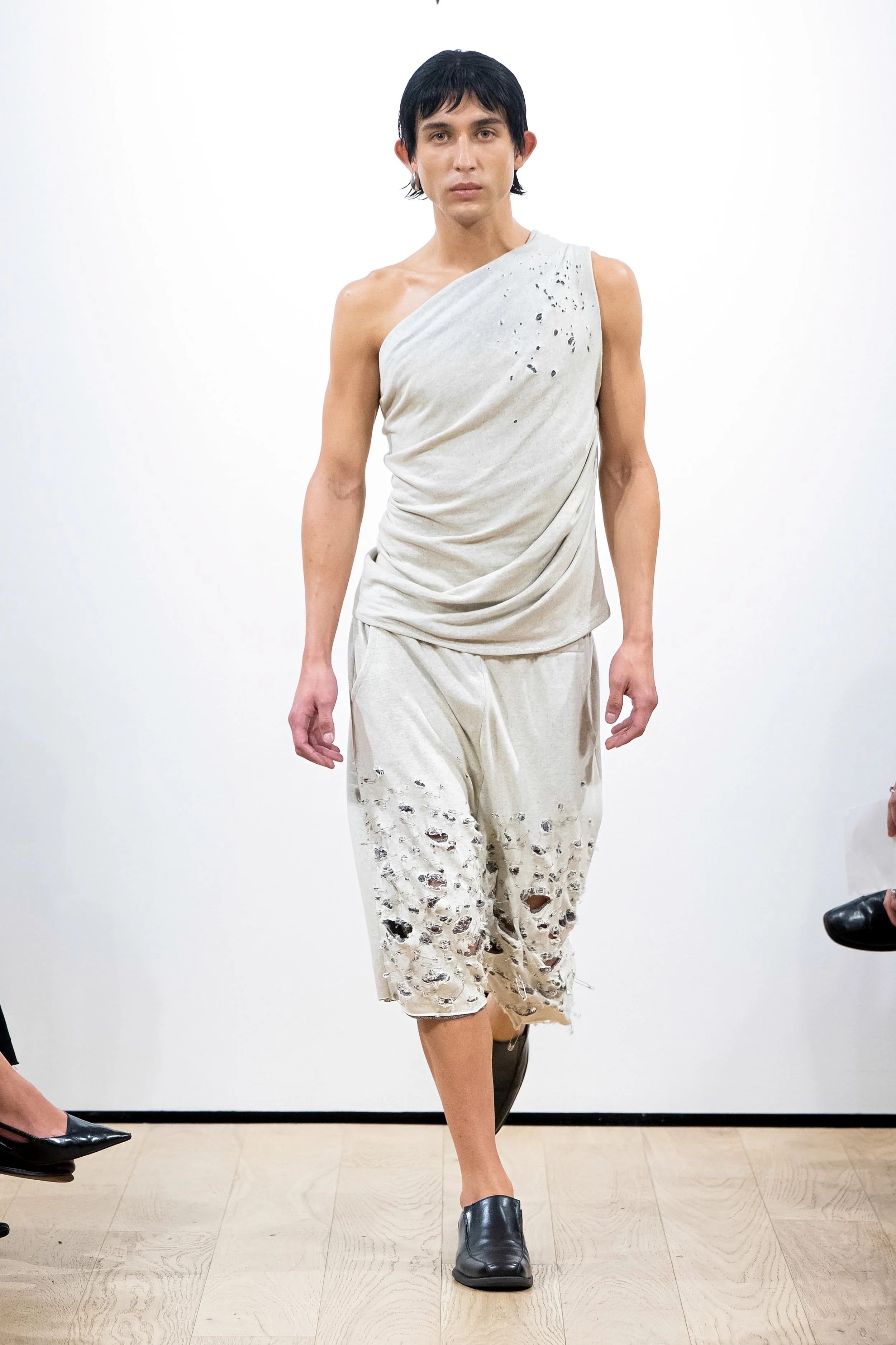
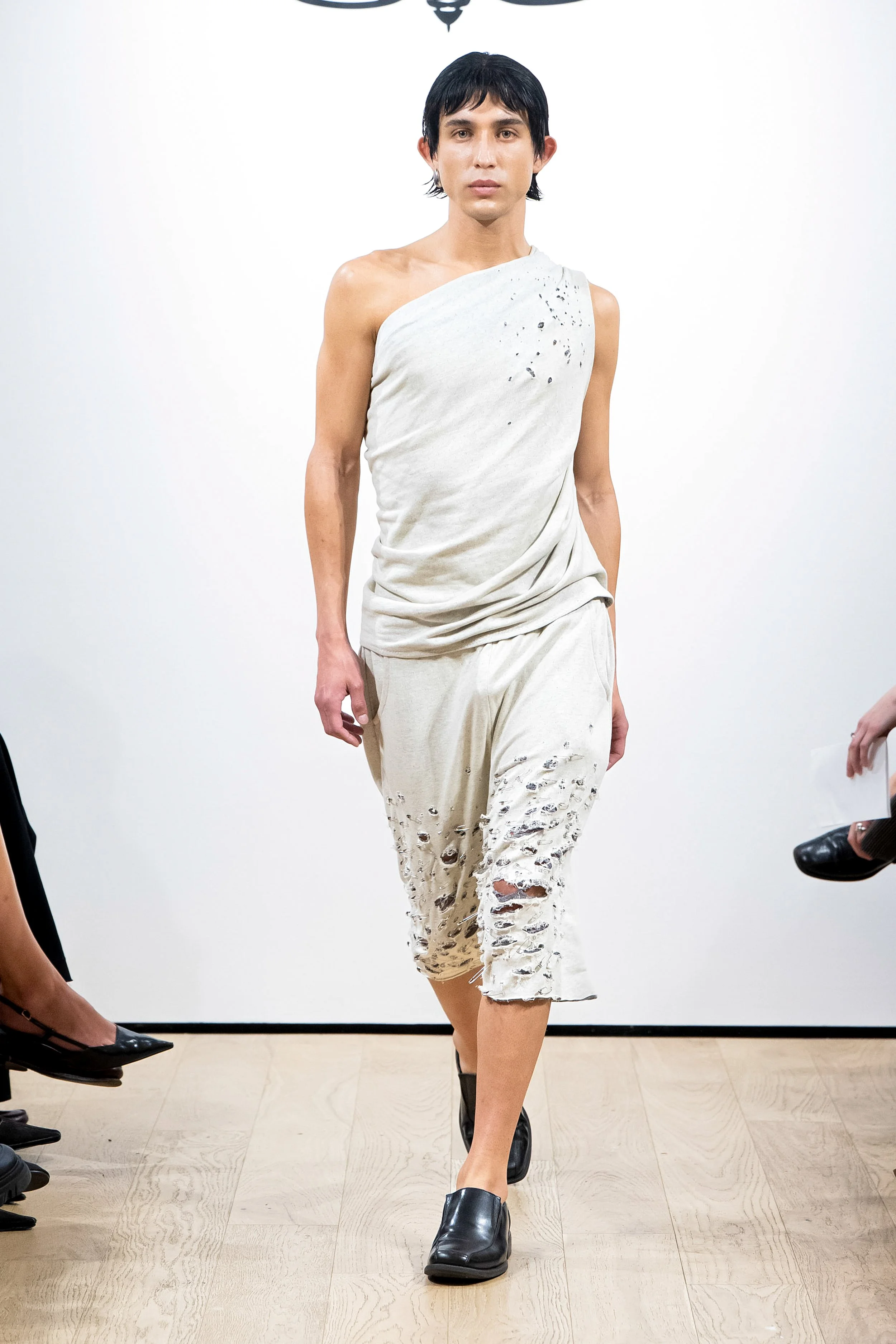
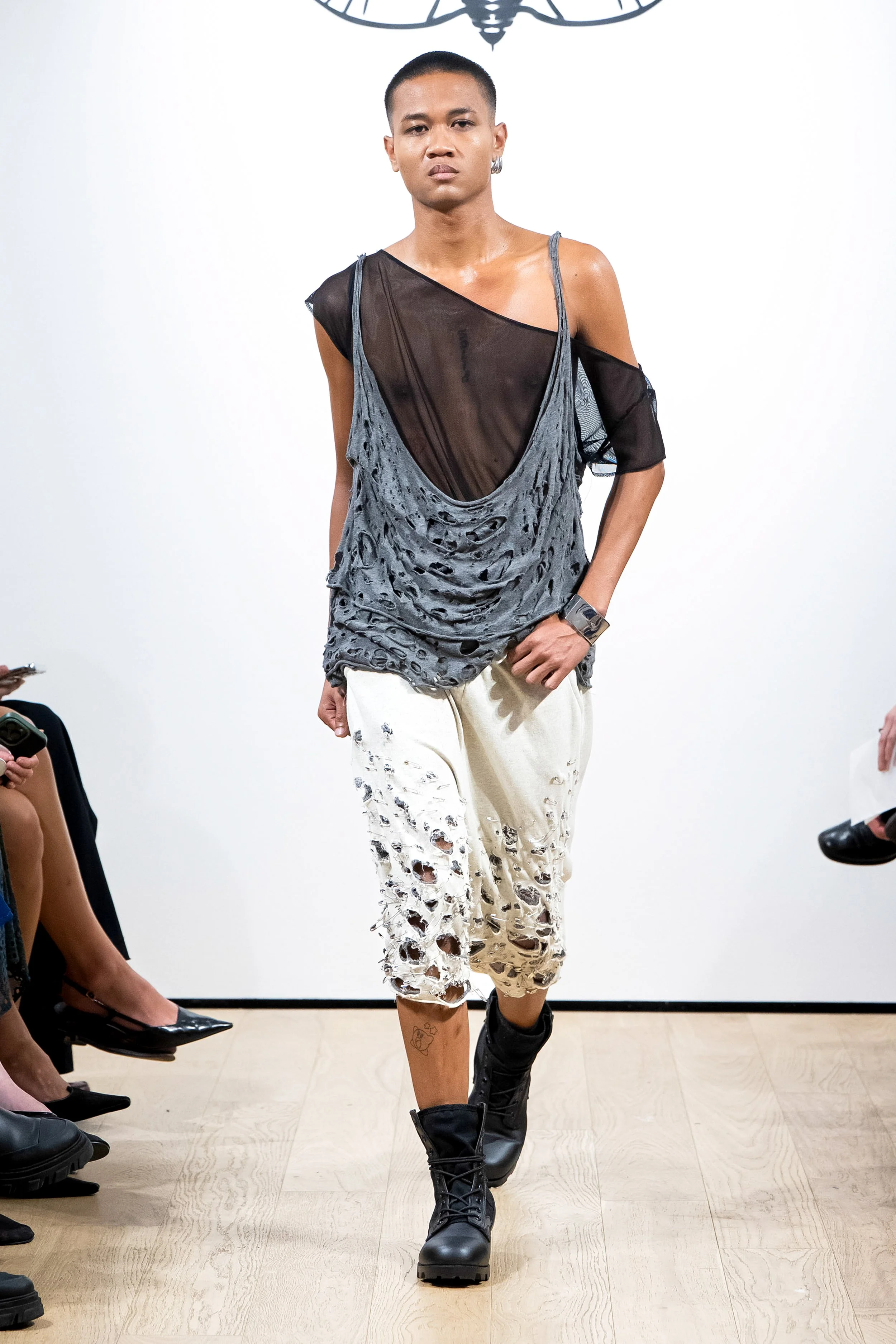
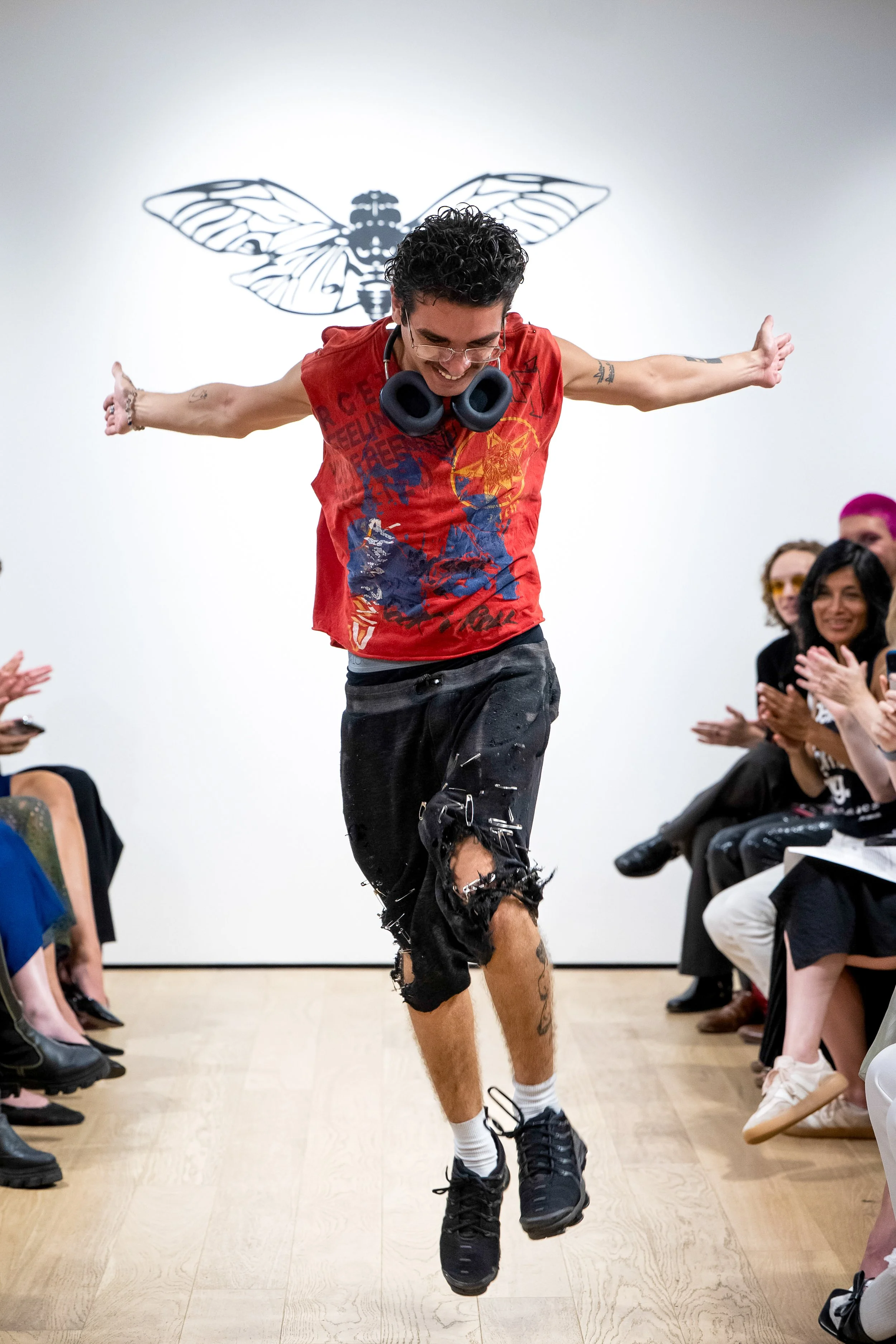
The safety pin shorts trace back to when I was in tenth grade, around the time my father was getting sick. I made them without much intention, a simple pair of shorts with shallow front pockets and a single back pocket that ended up holding everything I owned for the years that followed. To decorate them, and because it was what I could afford, I covered the surface in a cascade of safety pins, arranged from large to small. It was a cheap way to create texture, but it worked. They clinked when I walked. They caught the light. They were comfortable. And they became part of me.
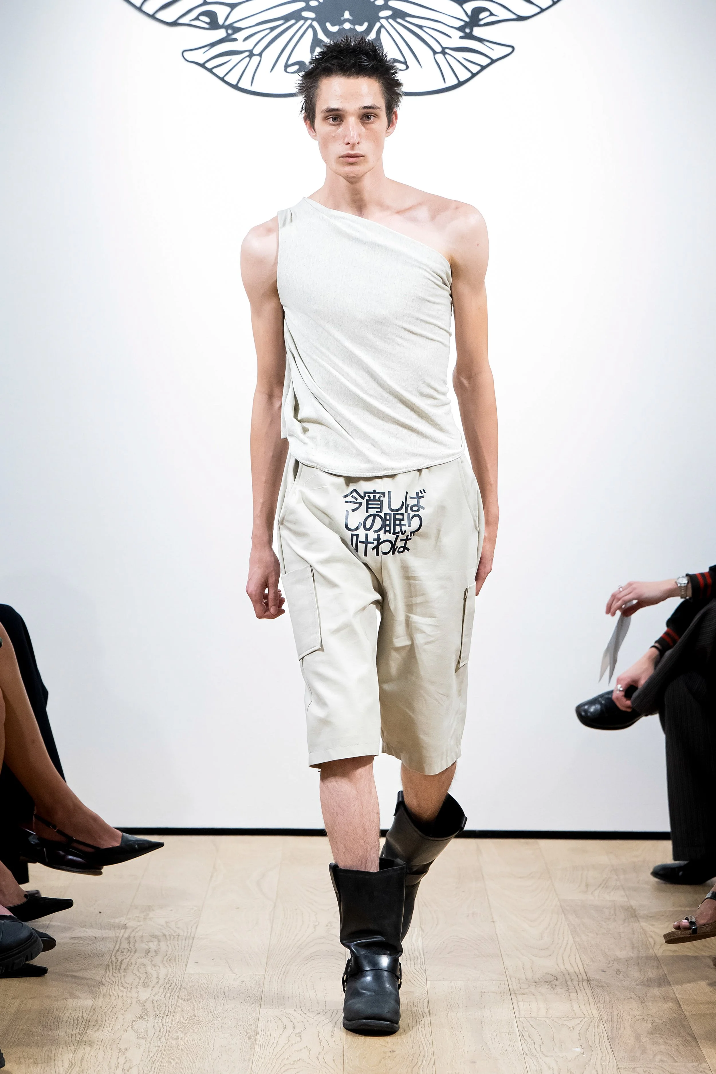
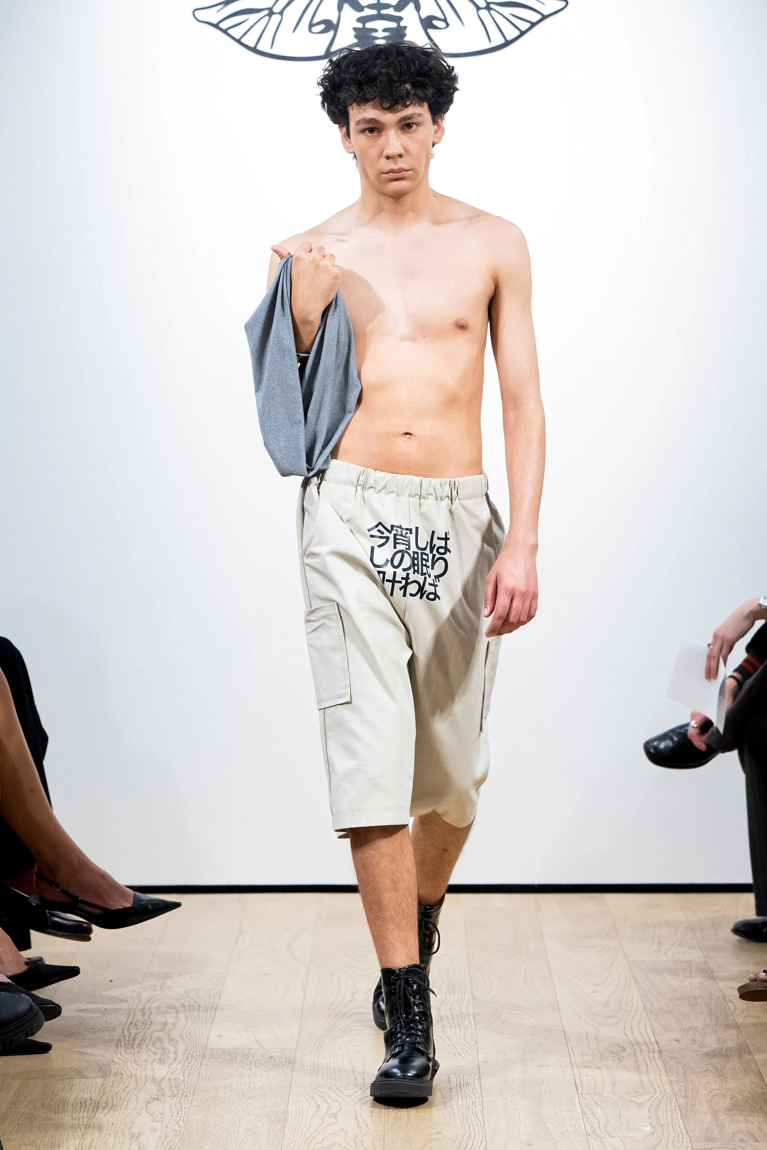
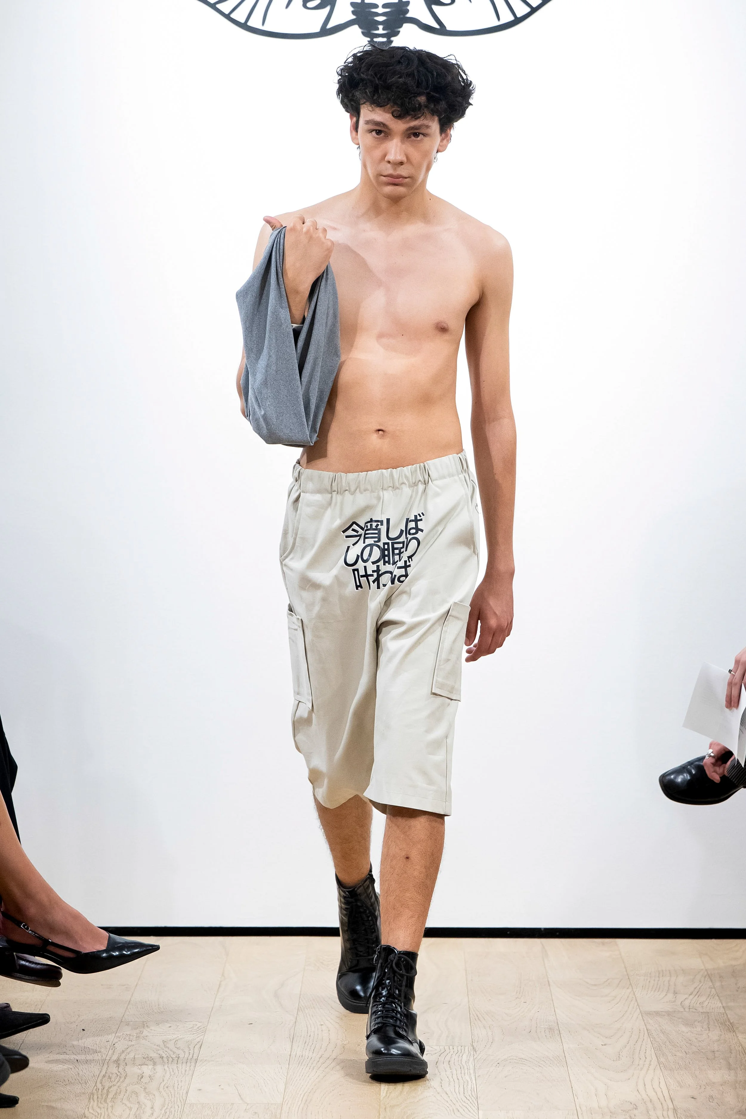
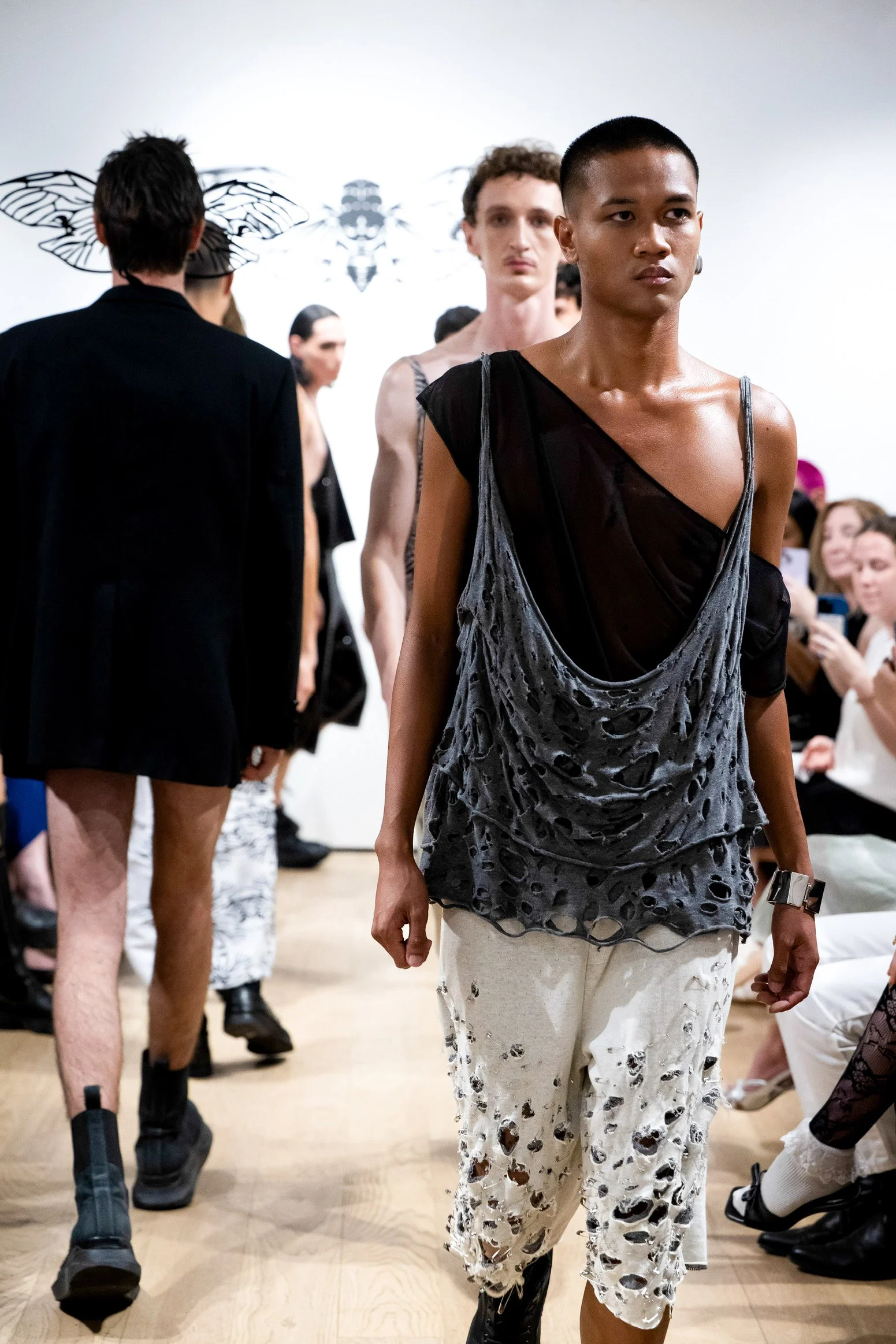
Back then, I did not have the tools to finish them properly, so the pins were left loose, easy to open and remove. Now they are all soldered shut, sealed permanently into the design. Over time, the pins tore the fabric apart, ripping cavernous holes that grew larger with wear, exposing more and more of my legs. Those holes, accidental at first, became the blueprint for an essential part of the CICAEDIA menswear silhouette: heavily decorated shorts, raw but from being well lived in.
Here, they reappear in a double faced cotton jersey, white knit on one side and a darker gray waffle knit on the other. When ripped open, the duality of the colorway is revealed. Another version is cut in a heavy textured wool, where each tear was punctured with safety pins and hand distressed over hours to replicate the genuine wear and tear of the original pair. What began as a small personal project in high school became a foundational language of this collection and character.
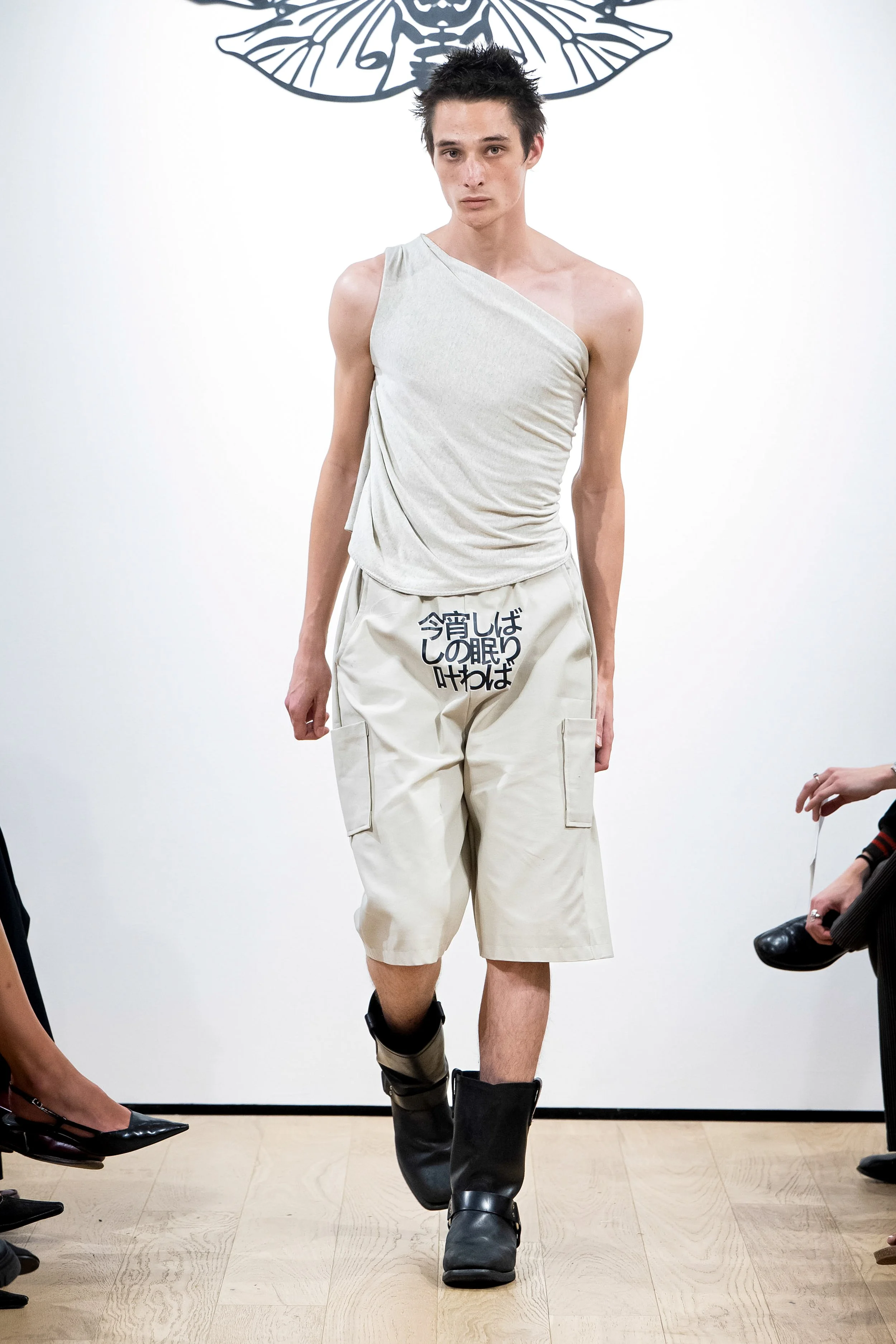
Plastered on the front of shorts in old-style Japanese “If tonight, even for a moment, sleep could be granted.” In English, that line is soft, something you might say to the person next to you, maybe sensually or almost as an afterthought. In an older Japanese form though, it becomes something else entirely: a formal request, almost a prayer, directed at something beyond you. During my thesis, this wasn’t just an expanded lyric from If Only Tonight We Could Sleep The Cure’s original song and the Deftones’ heavier sexier cover, it was the sentence looping in my head. The Cure felt like floating on color; the Deftones like being pinned back into place. I was somewhere in between psychedelic episode and sexually charged breakdown, caffeinated, unraveling. My dyslexia made it stranger. The way I had laid it out graphically, I kept reading it in English as “would, could, attack.” And honestly, that felt more accurate to where I was at. As an American, what struck me was how Japanese text made my exhaustion look dignified. Here, burnout gets flattened into jokes or bragging rights. But in this older phrasing, even my breaking point felt deliberate, like it belonged to a piece of a poem. My spirals, the all-nighters that seemed to last weeks, they didn’t look chaotic anymore. And here; they looked fresh. Sleep had come, and if I could I would’ve have handed some out in a gift bag for front-row seats.These graphics appear only on pieces untouched by tears, rips, or pins. They mark the threshold into refinement, a clean break from the preceding chaos, and swing the collection toward evening.
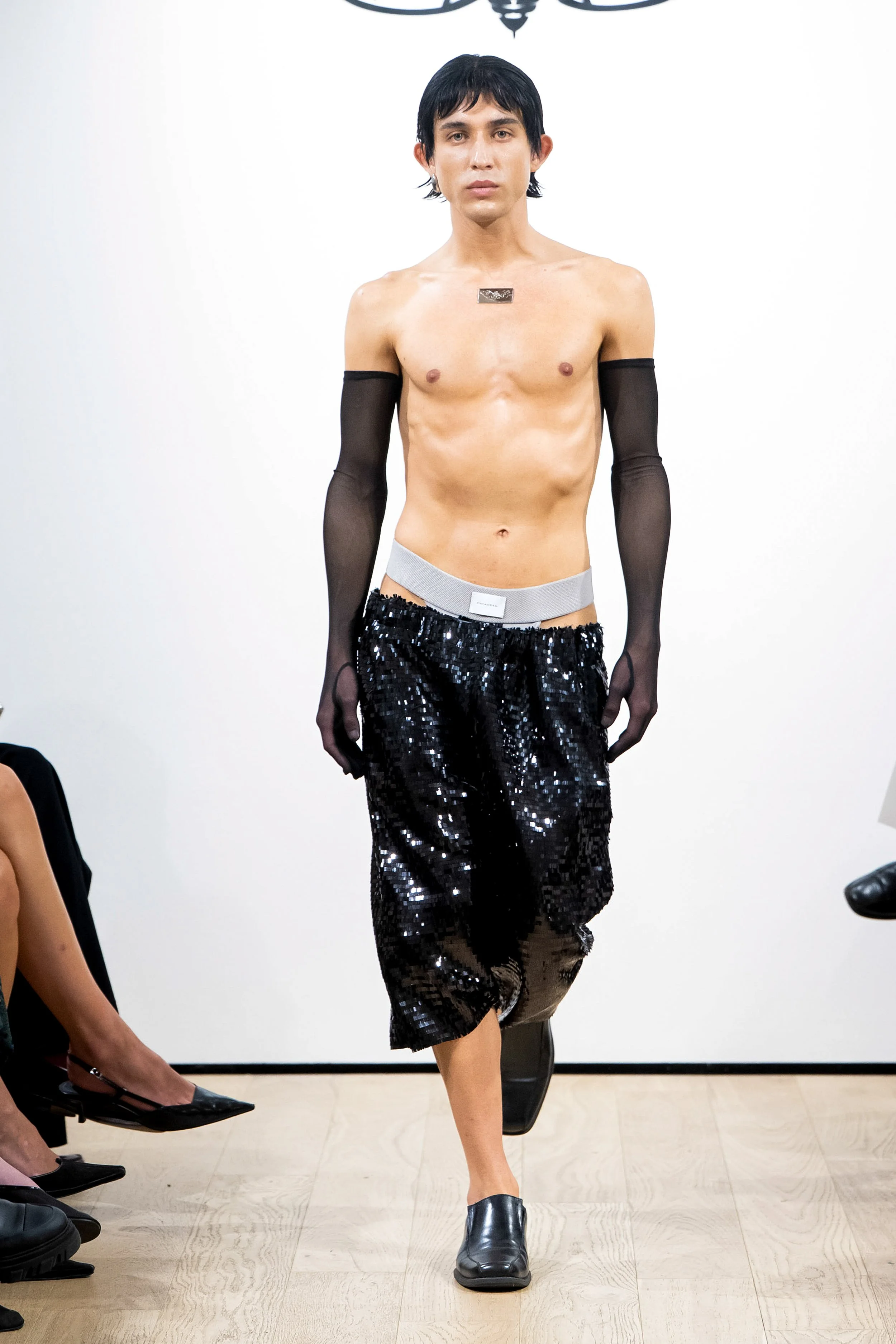
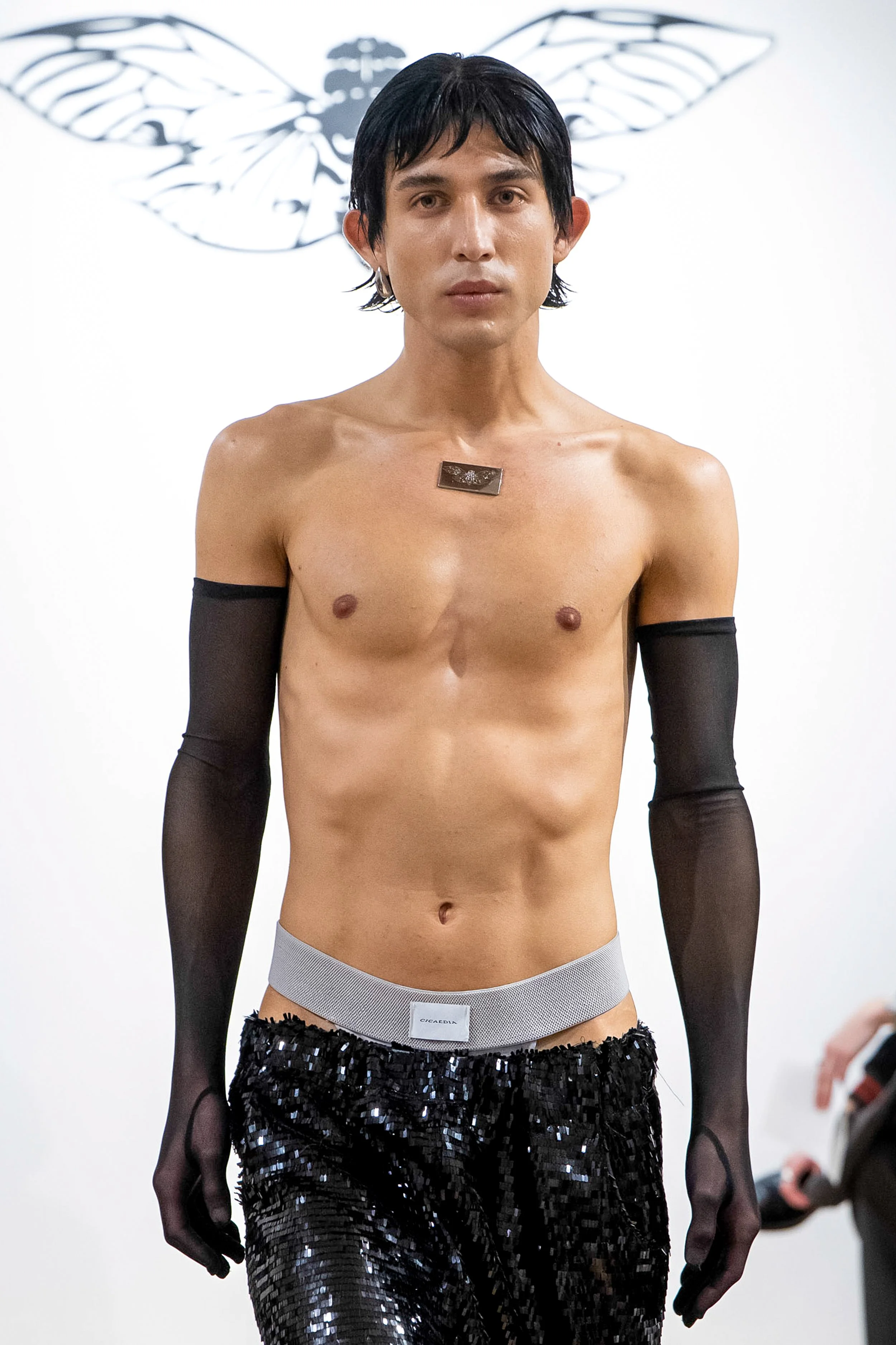
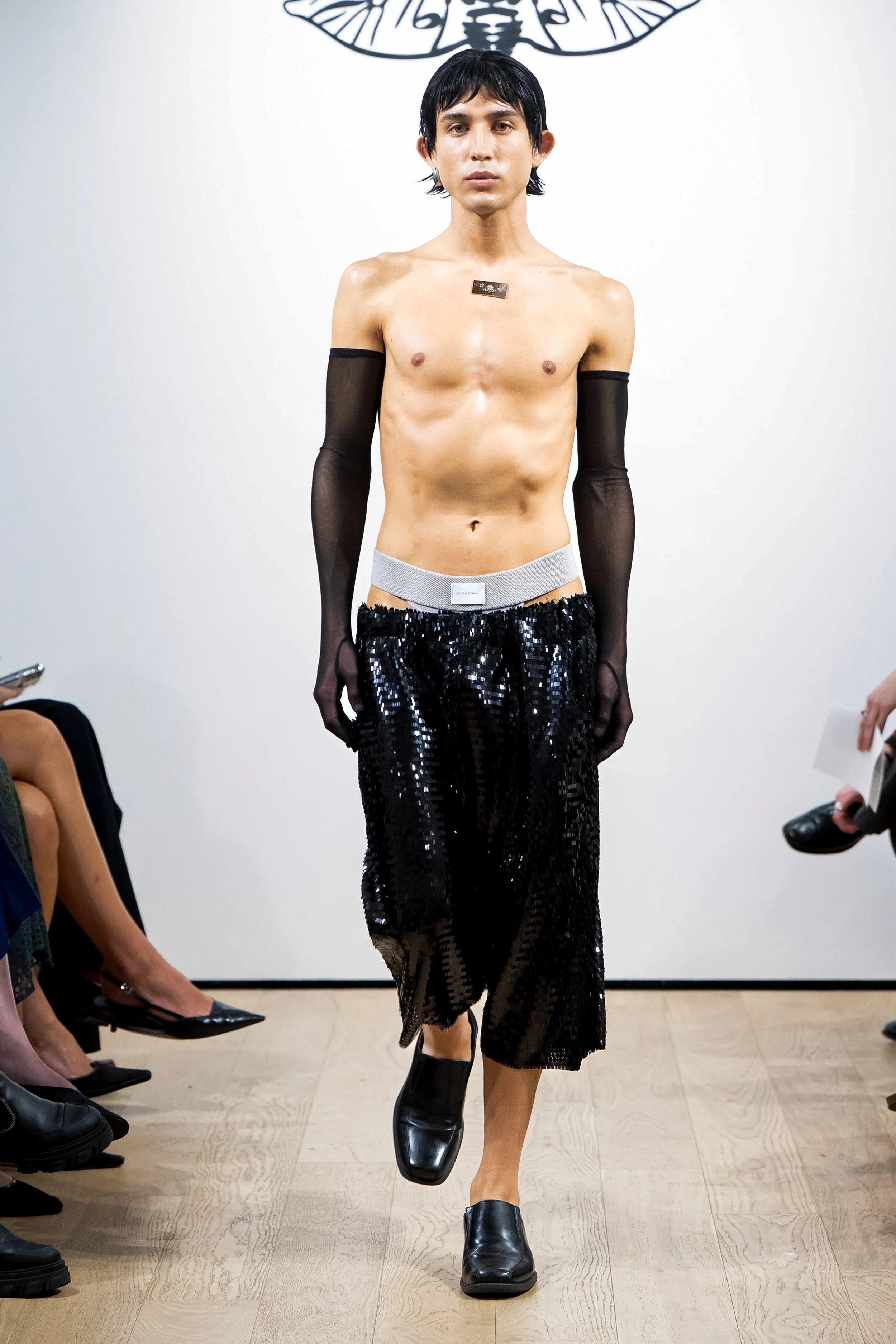
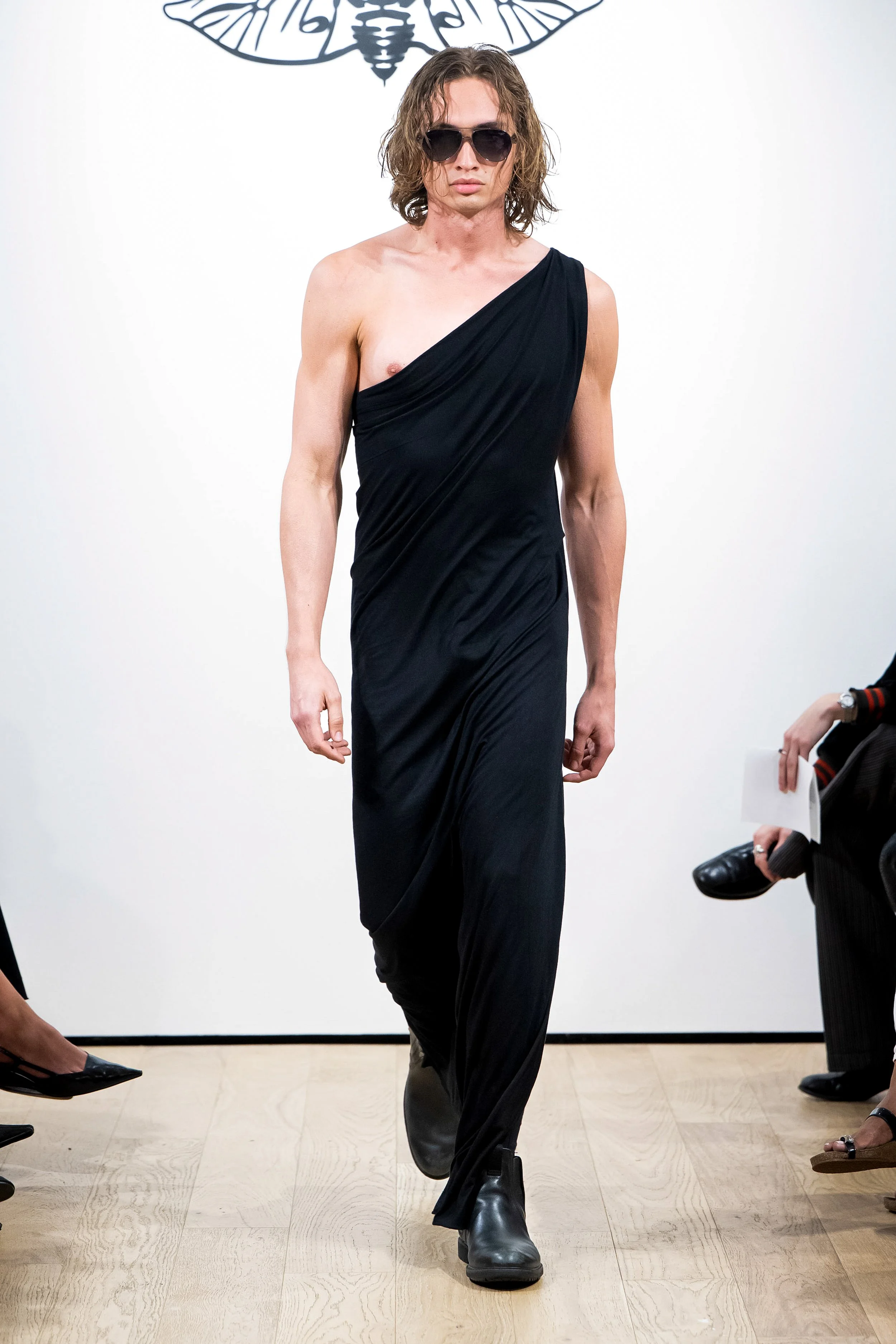
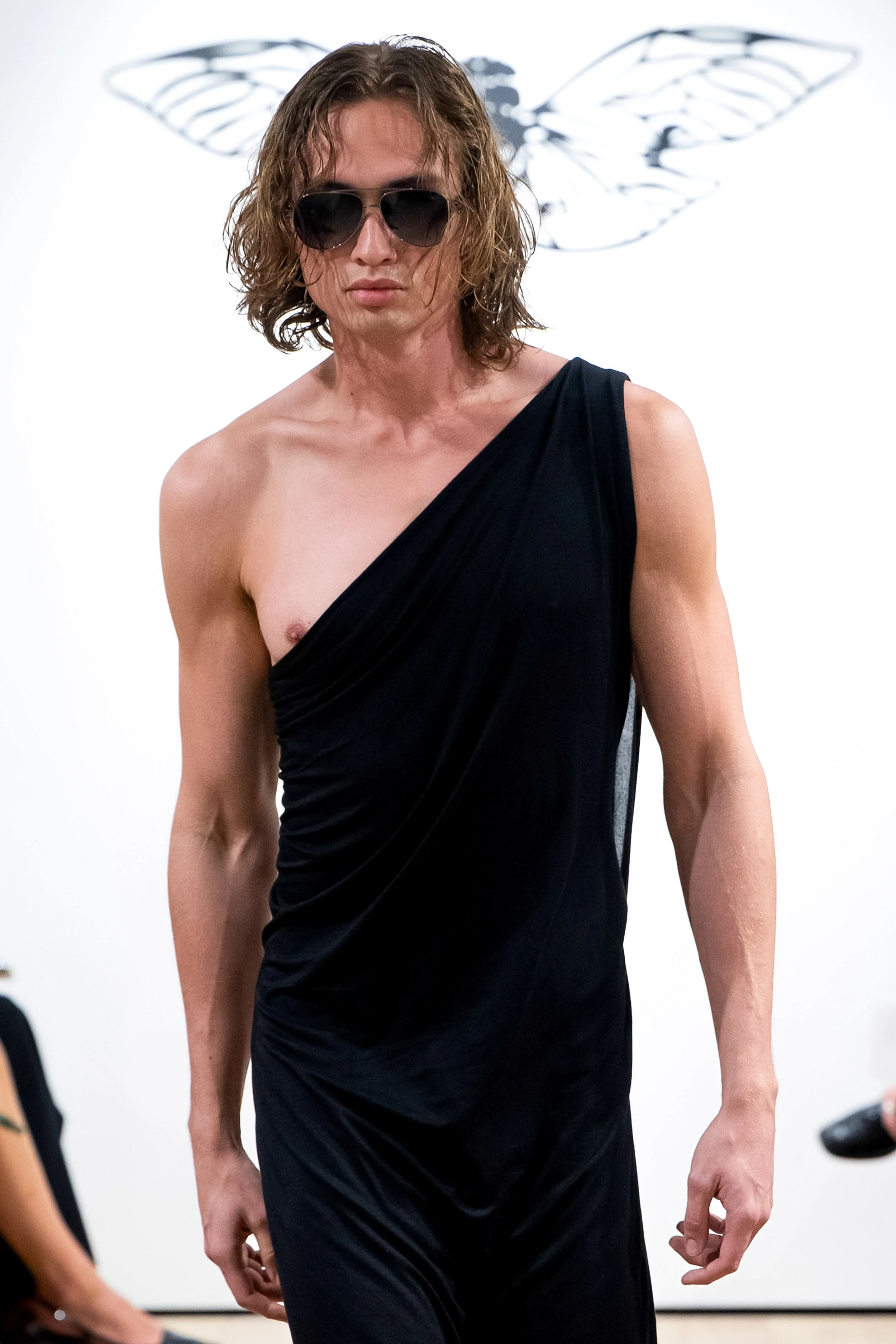
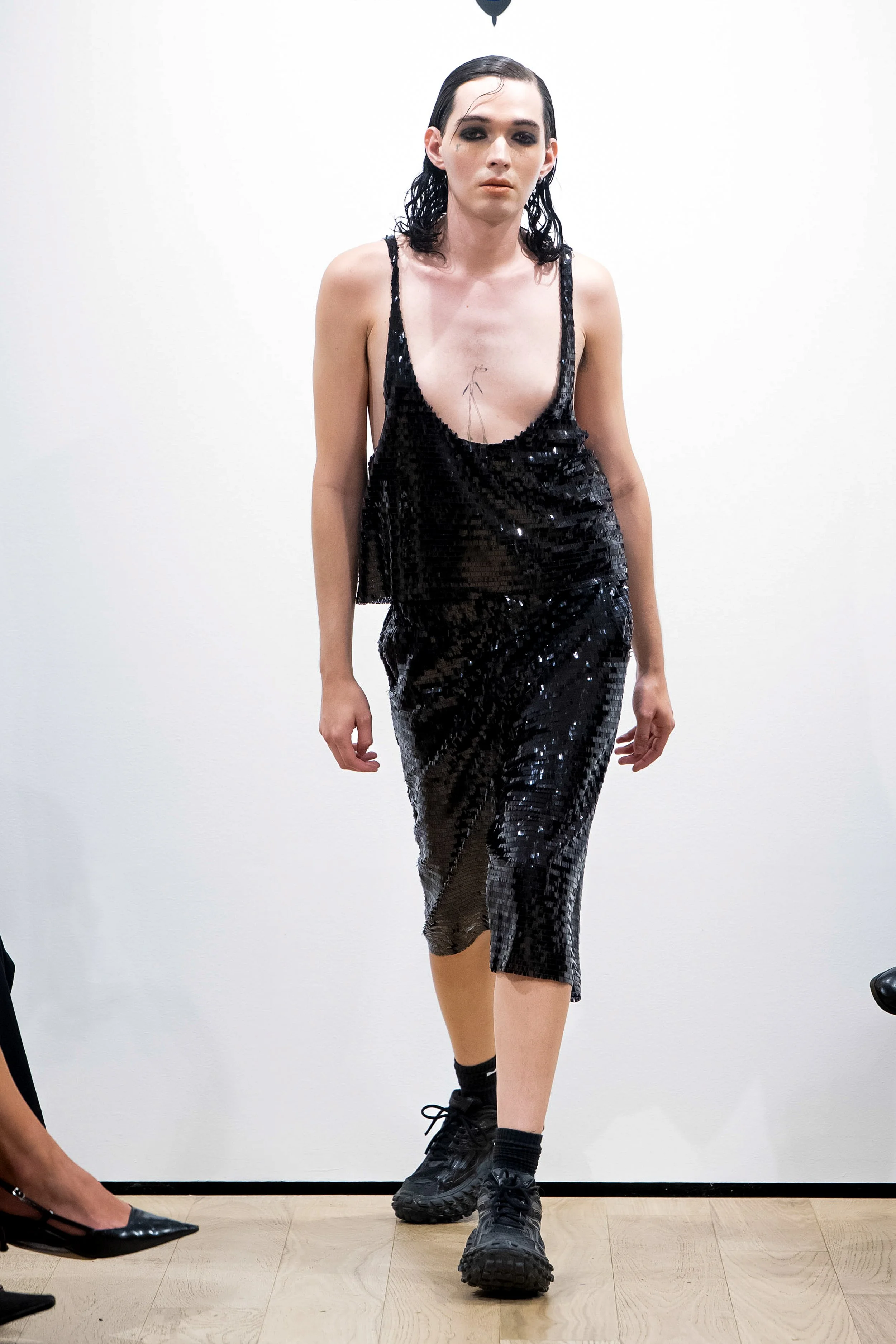
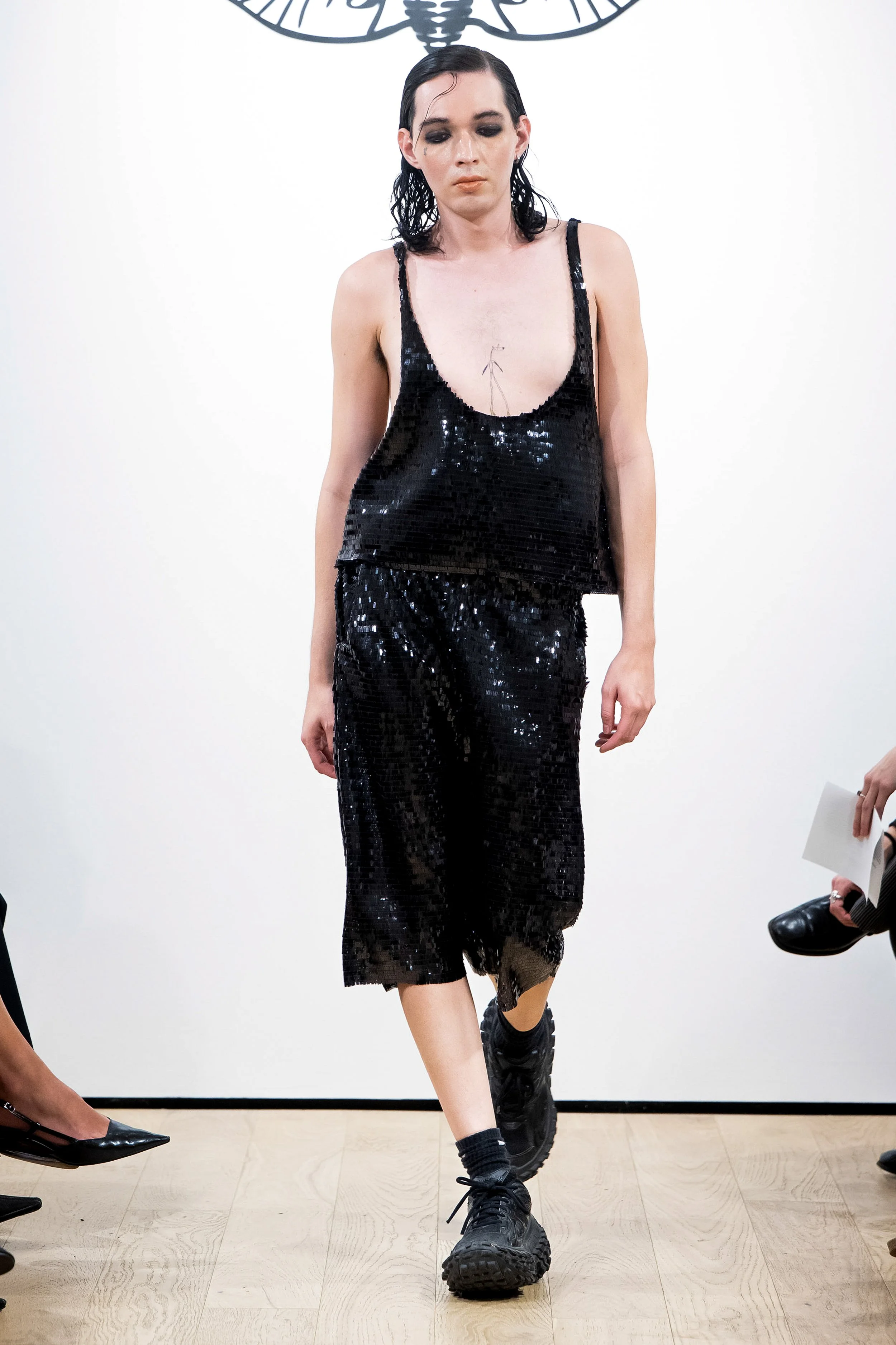
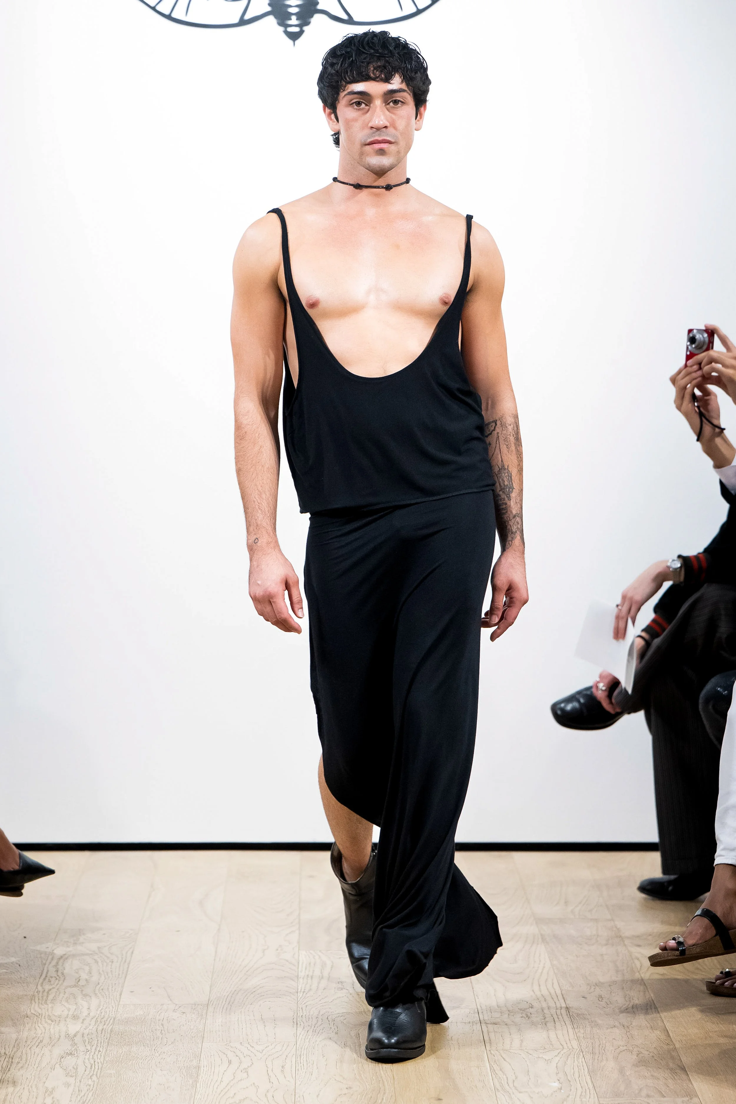
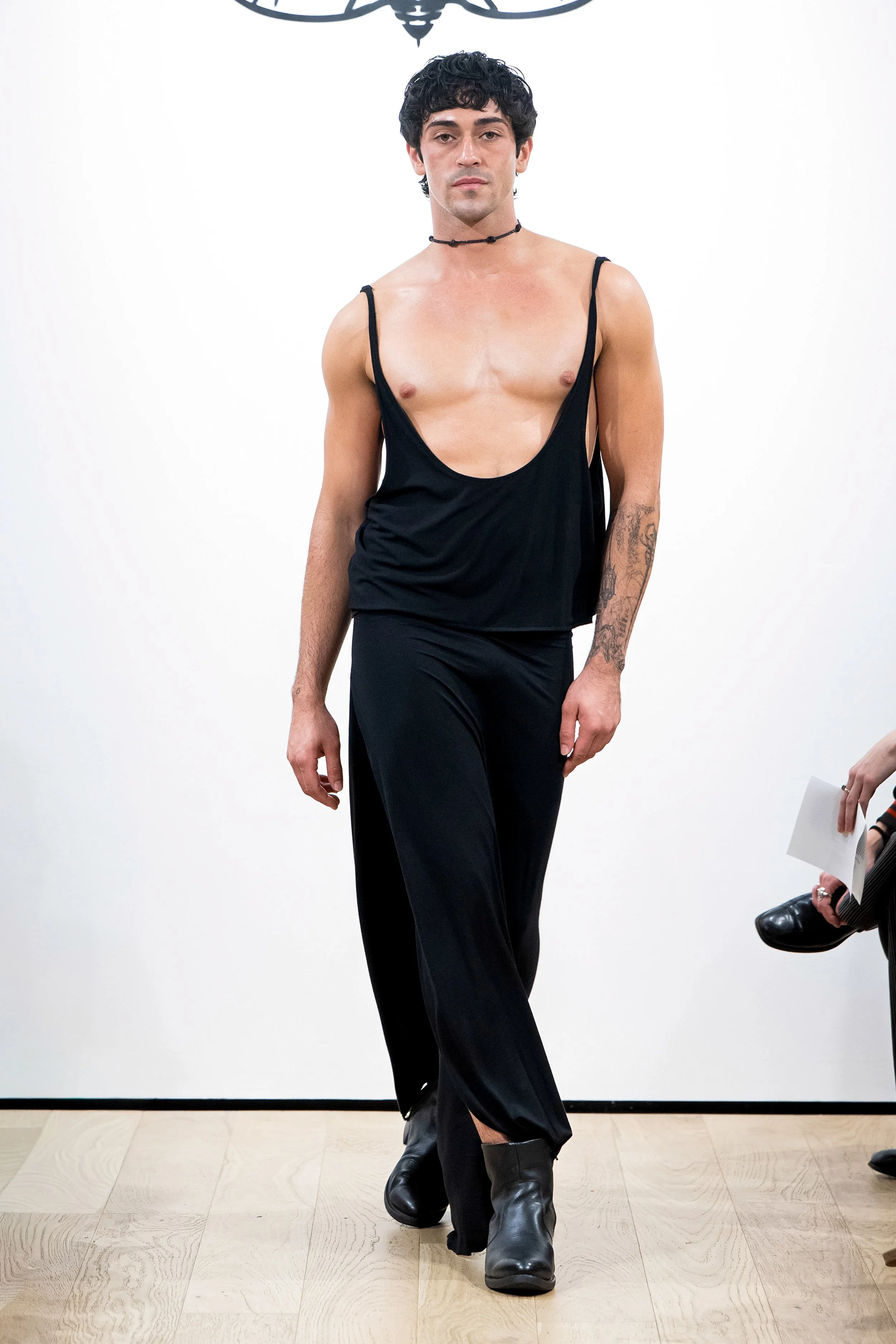
The men’s evening section closes the collection in mostly all-black looks, Two are built from black square-cut sequin fabric, made into shorts. One styled with a matching thin strap tank-top, the other styled bare chested, with sheer gloves, and a visible logo thong. The only embellishment being a silver logo plate at the center of the chest. Then the black jersey looks; completely draped pieces and sarong skirts that recall the toga, reinterpreted through CICAEDIA’s lens. Here also is the print again, made bigger and backed in white; a more direct nod and evolution to the imported Greek references that have been built into my label’s DNA since the beginning.
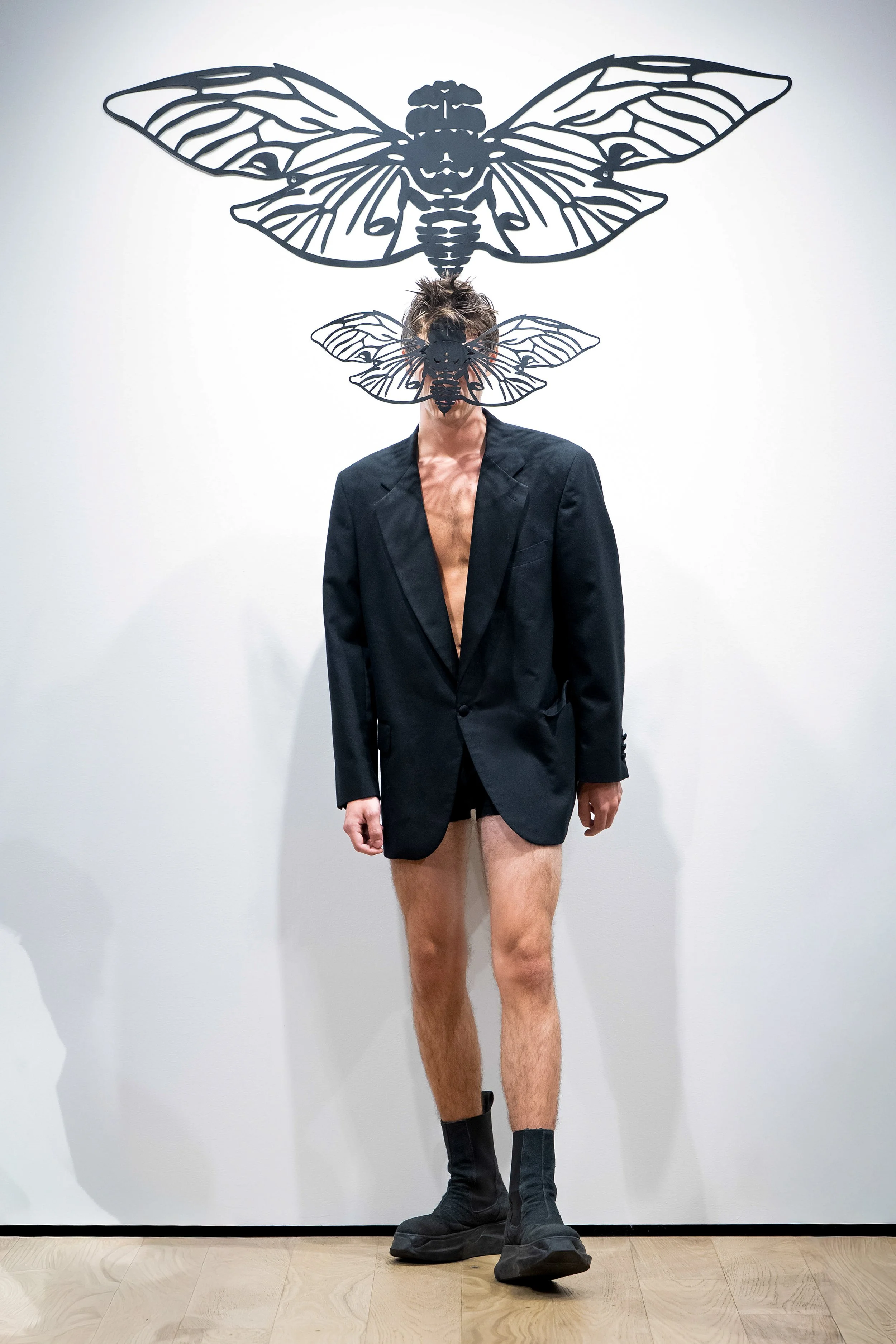
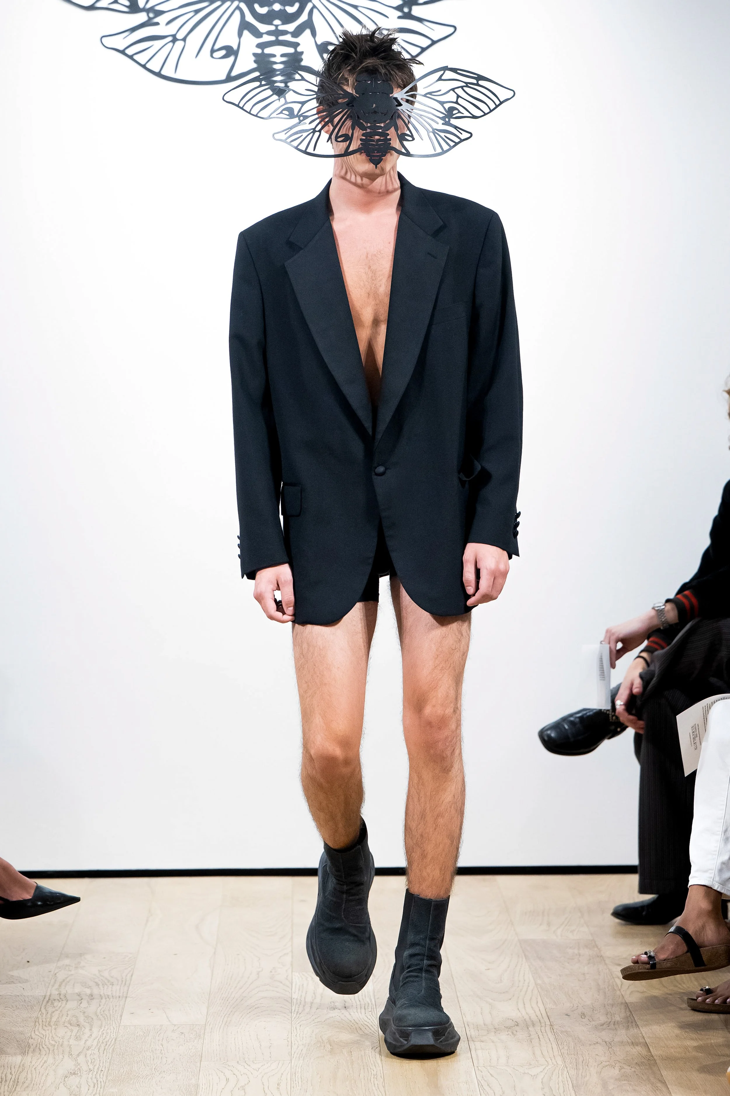
The final look stands apart. A tailored, oversized evening jacket lined in satin silk, worn with nothing but a pair of black boxers. It is stripped of ornament, but heavy with intent. The figure wears an oversized logo CICAEDIA cicada mask, laser cut and carrying the brand’s emblem; not as an accessory but as a sigil, a mark of identity and transformation. The show does not end in triumph. It ends with that lone figure stepping into the dark, face obscured, body half-dressed, caught between exposure and concealment. It is not a finale so much as a question left hanging, a suggestion that the story does not conclude here but continues beyond the edge of the light.
CICAEDIA UOMO isn’t about perfection. It’s about honesty. If womenswear is the attempt to control the narrative, this is where to let go; a space to build something more genuine, a reflection of who I am, what drives me, and who this line is for. If it were a moment I could show like a film; the last shot would not stay on me. It would move from me to someone else. A hoodie on the kid on a Ebike cutting through traffic. A man on the subway with holes tearing his tank-top wider. A girl laughing outside Kenka at three in the morning, eyeliner smudged, holding a cigarette she forgot she was smoking. None of it polished. All of it real. CICAEDIA UOMO is more focused on the reality of things; it’s about how you spend your life in the clothes you live in. About how you wear them, how they carry you through the day and into the next.
Schrödinger’s Dog is not innovation. It is recognition. It acknowledges the garments I slept in, the ones that absorbed blood and sweat and grief, and returns them to me as something undeniable. It is comfort mistaken for craft and despair recast as design, the wardrobe of collapse rebuilt into a monument of survival. It holds what was once evidence of breaking and insists that it is worthy of being seen.
Show-Notes Written by Yitzhak Rosenberg
Designed by Yitzhak Rosenberg
Runway Production, & Styling by Ryan Scheriff
Assisted by Indigo-boy David, Jordan Kennedy, & Bianca Fares
Sewing assistance by Irene Park, Peter Shonoda, & Sam Bettencourt
Set design done In-House
Casting by Fish Fiorucci at F10 Casting
Hair & Makeup by Sophie Hartnett & Rory Alvarez
Lead Runway Photography by FirstView Photographer Stefan Knauer and Editor Christina Borgo
Look-book photography by Andrew Morales
Backstage and Runway photography by Juan Hernandez, Maria Smith, Gianna Basile, Perri Sage, Sebastian Anderson, and more.

